Thursday, February 28, 2013

The Five Shape Landscape, Part 2

On The Way In, pastel, 8x10
This week we took the "five-shape" landscape one step further and arranged the composition so that the shapes were in descending sizes, with each shape roughly half the size of the next larger shape. The  scene in our reference photo was already divided up somewhat in that way, but we needed to resize some areas a bit to fit this little composition exercise.

By squinting and combining areas of similar value, we came up with our five shapes...errr...I later noticed I did better than that and actually started with only four initial shapes!

Below are some progression shots...


Thursday, February 21, 2013

The Five-Shape Landscape

Reflections on Big Creek, pastel, 10x8

This week I revisited an exercise I haven't done in awhile in my classes. The overall concept is a common approach used by many artists. But in this week's class, we began the painting by dividing the landscape into exactly five abstract shapes. This forces you to combine areas of the same or similar values, and establish the basic structure of the painting in terms of its abstract design, rather than the objects that are contained in the landscape.


I started by laying a sheet of tracing paper over the photo and seeing how I could divide things up. I did some shifting here and there to get better placement of some shapes. Okay so I see that I accidentally threw in a skyhole in shape #2...no worries, though...I ignored it in my underpainting.

Below are a few stages of my demo, starting with blocking in the five shapes. I used a few different values of warm hues, which worked nicely beneath the cool hues I used in the final layers.


alcohol wash underpainting


In our next class, I'm going to take this exercise one step further and divide the five shapes into specific descending sizes.

Sunday, February 17, 2013

Upcoming Workshop Schedule


INTERPRETING THE LANDSCAPE IN PASTEL

~ UPCOMING WORKSHOPS ~


One of the biggest hurdles I’ve encountered as an artist is moving past the point of copying a scene to interpreting a scene. As beginners, we all start by learning the mechanics of rendering (or copying) the subject matter with our medium of choice. But eventually, we want to move past that and portray our own version of what we see before us…to find our own artistic voice and tell our own story...which is why I've titled my workshops "Interpreting the Landscape in Pastel."

Depending on the length of the workshop, exercises will include some or all of the following:

·         Selecting a color palette – Exploring warm vs. cool and the limited color palette.
·         Developing a strong composition – How to find the ideal placement for every element.
·         Simplifying busy subject matter – Constructing “The Five-shape Landscape.”
·         Mark making – Painting a landscape in 100 strokes or less.

Workshop attendees should expect to push themselves out of their comfort zone and complete many thumbnails and small paintings in order to try out a variety of exercises and methods, rather than painting large pieces in the same manner you always have.

I’ll begin each day of the workshop with a demonstration and then provide plenty of individual help at the easel for the remainder of each day.

Following below is my updated 2013 schedule. Feel free to contact me with questions.


New York, NY - 2-day workshop
The PSA School for Pastels at the National Arts Club
15 Gramercy Park South
New York, NY 10003
March 15 & 16, 2013 (Fri. & Sat.)
$250
To register call 212-533-6931 or visit www.pastelsocietyofamerica.org

Gainesville, GA - 2-day workshop
The Quinlan Visual Arts Center
514 Green St.
Gainesville, GA 30501
March 21 & 22, 2013 (Thurs. & Fri.)
$220 members; $250 nonmembers
To register call 770-536-2575 or visit www.quinlanartscenter.org


Northern Wisconsin - 4-day workshop
(Lac Du Flambeau, WI)
Dillman's Art Workshop Retreat
Sept. 23 - 26, 2013
More details to come on this one.


2014:


Littleton, CO - 3-day workshop
Terry Ludwig Studios

8113 W. Brandon Dr.
Littleton, CO 80125
Jan. 24, 25 & 26, 2014
(fee TBD)
www.terryludwig.com
303-795-1232

Tuesday, February 12, 2013

Workshop Roundup - Pastel Society of Tampa Bay

I just returned from teaching a workshop for the Pastel Society of Tampa Bay in Dunedin, FL, and was also honored to serve as judge for their member show. This was a warm and enthusiastic group who welcomed me and took excellent care of me during my visit...from showing me around their town to wining and dining me! The workshop was hosted by the Dunedin Fine Art Center, which has to be the most impressive art center I've seen. We enjoyed an exceptionally well equipped and roomy studio space with great light!

Show below are my demos I painted during the workshop. I completed one demo each of the three days. My workshops focus on interpreting the landscape. It's a studio workshop, so we work from photos, and go through a series of exercises that help to interpret the landscape rather than just copy from the photo. I address composition, color palette and simplifying.

Calm and Quiet, pastel, 12x12

Golden Hour, pastel, 11x14

A Summer Afternoon, pastel, 11x14

Getting ready to wet down the underpainting
for Calm and Quiet

Critique time.

Our big, comfy studio.

My awesome group. The empty chair
belongs to Kathy Detrano, who's taking the photo.
(Thanks, Kathy!)

Monday, February 4, 2013

The Underpainting "Glow"

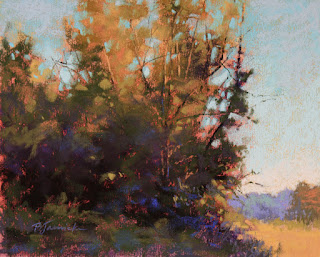
Morning Glow, pastel, 8x10

In my Monday class at Spruill Center for the Arts this morning, we created an underpainting that would   contrast nicely with the final colors used in the painting, as well help add to the warm glow of the sunlit areas.

I typically use a small variety of Nupastels (usually 4 or 5) for this type of underpainting. Nupastels work well for two reasons:
1) They're hard pastels and don't "gum up" when you wet down the underpainting, since less pigment is actually applied with a harder pastel than with the buttery soft brands. Very little pigment is needed for a liquid underpainting.
2) A small standard set of Nupastels comes in fairly bright colors...not usually good for straight painting, since your palette would lack the necessary neutrals and less intense hues, but ideal for setting up a colorful underpainting.

Although I often use a monochromatic underpainting to focus on establishing a strong value structure for the start of a painting, when I want color to play a key role in the painting, or to add a "glow" as I wanted here, I'll instead use strong color in this initial stage. (And yes, sometimes I do use a combination of both.)

Below are a few demo shots of the progression...