Thursday, September 27, 2012

Immersed in Water, Part 2

Late Afternoon Reflections, pastel, 12x9
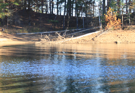
Late Afternoon Reflections is my demo from this morning's class in which we continued with our water series. Normally I take my demos to about 80 percent completion during the roughly hour and 15 minute demo time during class, and add just finishing touches after the class. However this was one of those demos that I felt the need to fuss with much longer than I like after class. I wiped down the water area more times than I care to admit. It's easy to get caught up in all the "ins and outs" of the ripples in the water when copying too much from the photo...a similar issue I ran into with last week's post on water.

reference photo

I went back and forth with how detailed to make the water ripples, as well as how hard and soft to make the edges. My distant trees seemed to be working with fairly soft edges, so I decided to keep the edges in the water mostly soft, except for a few areas that needed emphasis.

Regarding color (also part of my issue last week), I had to search for a way to handle the warm, peach highlights in the dark reflections in the water. I finally decided to interpret those warm highlights as more of a soft-edge glow rather than with linear strokes. This helped to give that upper right section of the painting an overall glow with it being placed near the warm, sunlit areas of the land and tree mass.

Still not being completely satisfied with this "problem painting," I thought the composition could be better...sooooooo...

Late Afternoon Reflections, pastel, 8x8

Monday, September 24, 2012

The Tree Portrait

Tree Study, 8x8, pastel
Tree Study is my demo from my Monday class this morning. The focus was, obviously, on trees, or what I like to call a "tree portrait." Normally when I do this exercise, I choose a scene that has one main tree and then a few others around it. The challenge is then to use color vibrancy (bright/saturated vs. grey/muted) and color temperature (warms and cools) to bring some sections of tree foliage forward and push others back. Soft and hard edges also play a part in all this.

We also discussed creating the overall shape of the tree, creating pleasing abstract shapes, rather than creating an exact copy of the shape as shown in the reference photo.


Thursday, September 20, 2012

Immersed in Water

Dancing on Water, pastel, 9x12
In my Wednesday and Thursday pastel classes, our focus for the next couple of weeks will be water and water reflections. I found a reference photo that I thought would make a great study for colorful water reflections. Well, it seemed like a good idea at the time. You'll notice in the reference photo below that there's a brilliant blue reflection that I thought would make for some wonderful, colorful reflections to paint.

reference photo
Often what makes for a beautiful, interesting photo, doesn't always translate well into good artwork. After some struggle with my demo (on both days!) I realized that focusing too much attention on the big blue mass in the lower half made the painting bottom heavy and split the composition into two unrelated sections. The blue reflection as it appeared in the photo just didn't seem to translate well as artwork when I tried to copy what I saw. So that's where artistic interpretation had to step in and work the same excitement from the brilliant reflection into a logical composition, and also work with the established color palette.

Dancing on Water is my demo from my Thursday class.


Monday, September 17, 2012

Minimal Stroke Exercise - Sept. 2012

Across the Lake, pastel, 7x5
I try to revisit this exercise often in my classes, especially when I have beginners in the class. As frequently as I've done this with my classes, I believe that it's just as valuable to me as it is to my students, since it reminds me to think twice before I put pastel to paper whenever I complete these demos. Far too often, I want to finish a painting quickly, or I just get lazy, and don't put enough thought into each and every stroke...the direction of the stroke, how I'm holding the pastel, and how hard or soft I should be applying the stroke: these all will affect the look of your painting.

To see an earlier post of a previous minimal stroke exercise for more details on how I go about this in my classes, click here:  http://barbarajaenicke.blogspot.com/2012/01/creating-pastel-painting-with-minimal.html

Thursday, September 13, 2012

Making Photoshop do the squinting for you, Part 2

The Light Beyond, pastel, 9x12
This week in my classes we worked again from a blurred photo for the beginning stages of the painting. With a mass of busy tree foliage from this week's subject matter, this little trick helps to simplify all those tiny leaves into the large shapes that need to be blocked into the painting first before fussing with any details. (To see what we did last week with "boats" that were chock full of little details, click here: http://barbarajaenicke.blogspot.com/2012/09/making-photoshop-do-squinting-for-you.html.)

blurred reference photo
original photo
For this painting, I actually worked much longer than I thought I would from the blurred photo. I thought it had enough information in it, and it already had a painterly feel to it. I felt that the original photo contained more information than you'd want to include in a painting, but I referenced it just a bit at the end for some highlight details.

Sorry, no step-by-step photos on this one, but my post from last week's class with the boats (link above) features demo photos.

Monday, September 10, 2012

First Day of the Fall Session at Spruill

"Sun and Shade" pastel, 9x12
When I have several new students in a pastel class, as I usually do at the start of a new session at the art center where I teach, I find it best to gear the first class toward this group. New pastel artists typically begin with a small supply of pastels and the cheaper paper. I can't blame them...the good stuff is expensive! And if they're just trying out a new medium, who wants to spend a fortune on art supplies when you're not sure if you'll like it.*

So I try as much as possible to use the same supplies that they'll probably use on their first day. My "day 1" exercise: working from a black & white photo. This helps diminish the frustration of trying to match exact colors in a reference photo, and focus on seeing the color pastel sticks in terms of values.

reference photo
My demo was done on Canson Mi-Teintes paper starting with three Nupastels and a Rembrandt or two, followed by 12 softer pastels.


*I should add that I do encourage my new students to gradually try the better pastels and surfaces, since for some artists, the better quality materials can make all the difference with whether they like the medium or not.

Thursday, September 6, 2012

Making Photoshop do the squinting for you.

Retired, pastel, 9 x 12
Most artists know all about squinting. That's how we simplify what we see in our subject matter in order to edit unnecessary details from our painting. Some days I feel like it gives me a headache when I do lots of squinting. And I'm certain that it's speeding up the formation of crows feet around my eyes!

So I thought I'd try a little trick in Photoshop to create as close as possible how I'd see a photo if I was squinting at it. Now I'm no expert in Photoshop, but I played around with all the tools I could find that blur a photo and reduce details.

 My blurred photo.
My original photo.
I chose these boats for the subject matter when I used this exercise in my classes this week, since they have lots of details that tempt artists to capture right away. I had students work from the blurred photo to get the painting going (especially for the underpainting) so that they couldn't even see many of the details. After the initial stages of the painting were underway, we traded the blurred photo for the real photo and added the finer details in the later stages.

Below are a few shots from my demo that I did in my Thursday class this week. I started with some warm hues using Nupastels, and then used an alcohol wash (I use a stiff bristle brush for this). It's on Uart 400 grit mounted to acid free foam board.