Thursday, November 29, 2012

Make Your Holidays Sparkle (With Value Contrast!)

Holiday Prep I, pastel, 9x12

Holiday Prep II, pastel, 9x12
This week in my classes I wanted to do something a little on the festive side for the holidays. And I also thought it was time to break away from photos again and tackle some still life work.

I chose the items for these still life set ups with a wide variety of surface textures in mind. In each, I purposely chose a mat finish ornament to go beside the other shiny ornaments. The transparent satin ribbon, cloth background and smooth wood surface also added a nice variety of textures to study closely.

Some of the ornaments also had textured decorations on them. It was interesting to note that even though some of the sparkly  designs on the ornaments were actually white in color, the highlights on the shiny ornaments were still lighter in value than the white areas, just due to the fact that the nondecorated area of the ornament was very reflective. The white areas were not a shiny texture and therefore didn't reflect nearly as much light. Shiny, reflective objects tend to have larger extremes of lights and darks than less shiny objects with more of a mat finish. The black fabric in the background is the least reflective and has the least amount of value contrast.

For both of these pieces, I started with a quick  monochromatic underpainting using an alcohol wash on mounted Uart 320 paper.

Underpainting for Holiday Prep I
The set up for Holiday Prep I

Monday, November 19, 2012

AAC Demonstration

Morning Radiance, pastel, 14x11
I had the wonderful opportunity this evening to do a pastel demonstration at the Atlanta Artists Center for a great group of enthusiastic artists. Although this was more of a generalized demonstration, I explained how I use color harmony and the use of neutrals to enhance my mostly green subject matter from my photo reference.

Morning Radiance was painted on mounted Uart paper with a monochromatic alcohol wash underpainting. In the underpainting stage, I focused on not only setting up the value structure for the painting, but simplifying the busy tree foliage into large, connected shapes. By contrasting the foreground and background with value and color temperature, I attempted to create a dramatic glow of light that was radiating from behind the thick foliage.

Thursday, November 8, 2012

Using Your "Ugly" Pastels

A Welcome Change, pastel, 12x9
Mountaintop Trees, pastel, 9x12
How do you get the most our of a vibrant color? Place it next to a very dull color. So when you're painting a colorful landscape such as an autumn scene, and have trouble getting those "brights" as vivid as you know they should appear, the problem usually isn't that you don't have bright enough pastels, you simply may not have dull enough pastels.

This week in my classes, we continued with autumn landscapes and focusing on balancing the brights with the greyed/muted colors.

I've noticed that most new pastel artists who are just getting started collecting their supply of pastels are usually lacking those all important dull, ugly pastels. They're the colors we usually overlook because  we think those colors will make the whole painting appear dull. In reality, they'll help get more mileage out of those gorgeous, saturated colors we love to use.

When deciding what colors to use for a painting that has bright colors, start by scribbling little color patches next to each other, finding one or two dull sidekicks for each bright color you need. These dull colors are greyed versions of each color family or very muted neutrals...they're usually those nondescript colors that are difficult to give a color name. The dull color you actually need is usually duller (and uglier) than you think.


Thursday, November 1, 2012

Grey Matters

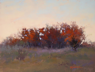
Fading Autumn Light, pastel, 9x12
In my Thursday class this morning we covered the importance of greys in landscapes that contain vibrant colors, such as autumn landscapes. In order to make those vibrant colors jump off the painting, you need to balance them up against muted or grey hues. Otherwise, you just have lots of bright colors competing with each other, and end up with a very busy look, or often even more muddied color than if you used a variety of greys (i.e...grey-blue, grey-purple, etc.).

In my demo (above) I began with very muted hues and greyed versions of the bright autumn colors that would ultimately be added in later stages. Adding those bright hues is definitely a "less is more" practice...a little dab of a bright color up against a grey or muted hue goes a long way!

I wasn't completely pleased with composition on this one...things ended up a bit too centered for my taste. "Fading Autumn Light" may be considered for the chopping block, and possibly come back to life as a smaller size. Still thinking about it.

We'll probably do one more class that focuses on greys in the autumn landscape.

***

In my Monday class earlier this week, we focused on edges. We also worked from an autumn scene, well, just because it IS autumn! The goal here was to exaggerate hard and soft edges in order to move the viewer's eye around to specific "resting spots" around the painting, carefully choosing where those spots are placed.

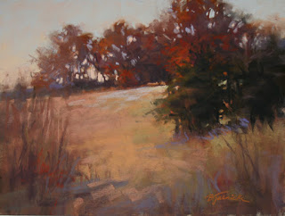
November Reds, pastel, 9x12

For my demo of "November Reds" I began setting up those hard and soft edges right from the start in the underpainting, shown below...

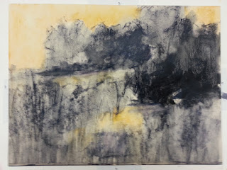
Underpainting for November Reds