Friday, December 21, 2012

Merry Christmas to All!


Just a quick little note to wish you all holiday greetings and to say thanks for following my blog. The comments and feedback that you all contribute are very appreciated and I thoroughly enjoy reading them all.

I'm looking forward to a busy, but hopefully exciting 2013, with some workshops to teach, conventions to attend and a solo show that I'll be talking more about soon!

Wishing you all a fantastic 2013!

Friday, December 14, 2012

Getting Things Going

Work in progress (not yet titled), oil, 14x18

Because of holiday commitments closing in, I may have to put this piece on hold for a bit. Who knows, maybe I'll be able to squeeze in some more time on it next week. I usually don't like to have such a long hiatus between the start of a painting and when I can continue on it. Often I lose sight of what initially inspired me to paint it. Hopefully, though, I've captured enough here to keep me going once I have time to continue.

I've come to think that one of the most important aspects of the the beginning stages of a painting is to keep things changeable and not overdefine too much. There are sometimes key elements that I do want to lock into a specific spot, but otherwise, I want to keep my edges sort of "mushy" so I can tweak them this way or that as the painting evolves. This also helps me to keep my edges soft in less important areas of the painting.

Below are a couple of other examples of paintings in early stages.


Initial underpainting for "December Heat Wave"
pastel, 16x20
Above is the initial underpainting for a recent pastel piece. I defined a few key areas with some crisp edges, but otherwise kept all other areas soft and changeable so I could easily make adjustments as the painting evolved.


Roughly the middle stage of "Rum River"
pastel, 16x20

This example above is a little further along, but I still held off as long as possible to define many details. And even when I decided the painting was finished, I left some areas undefined that I originally thought I would work on some more.

Now...to the gift wrapping and cookie baking!

Friday, December 7, 2012

"River Magic" Progression

River Magic, pastel, 12x16
River Magic was painted in the studio after a lackluster attempt at a plein air painting in oil of this same scene. Looking back at the plein air version, I guess it wasn't so bad, but I just moved very slowly on it and didn't get very far. I think eventually I lost sight of what I wanted to do with the painting.

Back in the studio I looked over some photos I took of the scene. I also tried something with the photos that I hadn't done in awhile. I went into Photoshop and increased the color saturation...not a lot, but just enough to have some additional color information to work with in the painting. Since it was somewhat of a backlit scene, the light was pretty flat in most areas except for the thin highlights on the trees and in a few spotty places on the water. I needed to find a way to create interest in the water and background trees without the use of very much value contrast. When I don't have value contrast to work with, I often make use of color contrast to create interest.


original photo

Increasing the saturation in Photoshop basically exaggerates
what little bit of color is already present.


my plein air version (oil)

The dramatic highlights on the trees were what originally caught my eye when painting this on location, so I still wanted to be sure to capture that in my next attempt. I think I did manage to get some of that down in the plein air version.

Since I decided that color was going to play a key role in my pastel version, I started with a more colorful underpainting rather than my usual monochromatic value structure.

A few demo shots of the beginning stages...

initial layers using Nupastels
alcohol wash
getting the background going

I have many failed plein air paintings, but I consider each and every one very valuable time spent. Each one represents more time studying the landscape and learning its nuances. For this particular one, I wanted to try the studio version very soon after the plein air attempt so that much of the scene would still be fresh in my memory. It really was a very beautiful, magical spot along the Chattahoochee River on the day I painted there, and that's what I wanted to capture with the dramatic backlighting and subtle color contrasts. It's a nearby location for me, so hopefully I'll be back to paint there many more times!

Thursday, November 29, 2012

Make Your Holidays Sparkle (With Value Contrast!)

Holiday Prep I, pastel, 9x12

Holiday Prep II, pastel, 9x12
This week in my classes I wanted to do something a little on the festive side for the holidays. And I also thought it was time to break away from photos again and tackle some still life work.

I chose the items for these still life set ups with a wide variety of surface textures in mind. In each, I purposely chose a mat finish ornament to go beside the other shiny ornaments. The transparent satin ribbon, cloth background and smooth wood surface also added a nice variety of textures to study closely.

Some of the ornaments also had textured decorations on them. It was interesting to note that even though some of the sparkly  designs on the ornaments were actually white in color, the highlights on the shiny ornaments were still lighter in value than the white areas, just due to the fact that the nondecorated area of the ornament was very reflective. The white areas were not a shiny texture and therefore didn't reflect nearly as much light. Shiny, reflective objects tend to have larger extremes of lights and darks than less shiny objects with more of a mat finish. The black fabric in the background is the least reflective and has the least amount of value contrast.

For both of these pieces, I started with a quick  monochromatic underpainting using an alcohol wash on mounted Uart 320 paper.

Underpainting for Holiday Prep I
The set up for Holiday Prep I

Monday, November 19, 2012

AAC Demonstration

Morning Radiance, pastel, 14x11
I had the wonderful opportunity this evening to do a pastel demonstration at the Atlanta Artists Center for a great group of enthusiastic artists. Although this was more of a generalized demonstration, I explained how I use color harmony and the use of neutrals to enhance my mostly green subject matter from my photo reference.

Morning Radiance was painted on mounted Uart paper with a monochromatic alcohol wash underpainting. In the underpainting stage, I focused on not only setting up the value structure for the painting, but simplifying the busy tree foliage into large, connected shapes. By contrasting the foreground and background with value and color temperature, I attempted to create a dramatic glow of light that was radiating from behind the thick foliage.

Thursday, November 8, 2012

Using Your "Ugly" Pastels

A Welcome Change, pastel, 12x9
Mountaintop Trees, pastel, 9x12
How do you get the most our of a vibrant color? Place it next to a very dull color. So when you're painting a colorful landscape such as an autumn scene, and have trouble getting those "brights" as vivid as you know they should appear, the problem usually isn't that you don't have bright enough pastels, you simply may not have dull enough pastels.

This week in my classes, we continued with autumn landscapes and focusing on balancing the brights with the greyed/muted colors.

I've noticed that most new pastel artists who are just getting started collecting their supply of pastels are usually lacking those all important dull, ugly pastels. They're the colors we usually overlook because  we think those colors will make the whole painting appear dull. In reality, they'll help get more mileage out of those gorgeous, saturated colors we love to use.

When deciding what colors to use for a painting that has bright colors, start by scribbling little color patches next to each other, finding one or two dull sidekicks for each bright color you need. These dull colors are greyed versions of each color family or very muted neutrals...they're usually those nondescript colors that are difficult to give a color name. The dull color you actually need is usually duller (and uglier) than you think.


Thursday, November 1, 2012

Grey Matters

Fading Autumn Light, pastel, 9x12
In my Thursday class this morning we covered the importance of greys in landscapes that contain vibrant colors, such as autumn landscapes. In order to make those vibrant colors jump off the painting, you need to balance them up against muted or grey hues. Otherwise, you just have lots of bright colors competing with each other, and end up with a very busy look, or often even more muddied color than if you used a variety of greys (i.e...grey-blue, grey-purple, etc.).

In my demo (above) I began with very muted hues and greyed versions of the bright autumn colors that would ultimately be added in later stages. Adding those bright hues is definitely a "less is more" practice...a little dab of a bright color up against a grey or muted hue goes a long way!

I wasn't completely pleased with composition on this one...things ended up a bit too centered for my taste. "Fading Autumn Light" may be considered for the chopping block, and possibly come back to life as a smaller size. Still thinking about it.

We'll probably do one more class that focuses on greys in the autumn landscape.

***

In my Monday class earlier this week, we focused on edges. We also worked from an autumn scene, well, just because it IS autumn! The goal here was to exaggerate hard and soft edges in order to move the viewer's eye around to specific "resting spots" around the painting, carefully choosing where those spots are placed.

November Reds, pastel, 9x12

For my demo of "November Reds" I began setting up those hard and soft edges right from the start in the underpainting, shown below...

Underpainting for November Reds

Thursday, October 25, 2012

Study, study, study!

In all of my pastel classes this week we focused on doing small, timed studies. I find this to be a great exercise to not only prepare for a larger painting, but also to simply increase your painting skills (and painting speed) by getting more painting mileage behind you. Some other benefits to doing quick, small studies:
- You're more inclined to try different, riskier approaches since you know you won't have very much time invested in each little piece...you'll quickly see what works and what doesn't.
- You're less inclined to fuss over each area of the painting since it's not meant to be a finished piece.
- You'll think more in terms of the "big picture" rather than minor details, which helps you to narrow in on what you want to say with the painting.

In my Thursday class, we focused on composition and painted three versions of the same landscape using different formats for each (square, vertical and horizontal), spending no more than about 20 - 30 minutes on each. Below are my demos of each...

The Long and Winding Road I, 6x6

The Long and Winding Road II, 8x6

The Long and Winding Road III, 6x8

In my Monday class earlier in the week we focused more on timed exercises to help everyone get more in the habit of blocking in larger shapes and quickly getting the entire surface covered, rather than getting caught up in unnecessary details. Students had 30 minutes to work on each of three separate paintings. Below are the two demos I did for that class:

Does This Go Anywhere?, 10x8

Uphill, 10x8
The paintings at the top of this post are done on Sennelier LaCarte paper and the ones just above are on gatorboard prepared with pumice gel (toned first with a warm neutral color).

As I observed the progression of the three paintings each student did in each class, most every student made substantial improvements from the first one to the third one!

Tuesday, October 16, 2012

Starting with a Plan

Evening Shade, pastel, 8x8
This is a demo from a class I held this evening in which we focused on the basics of establishing values. Using a monochromatic underpainting (my favorite type of underpainting these days), we set the stage with our value structure, and build upon that structure with a fairly limited color palette. We worked from a black and white photo, one of the best methods I've found to teach values.

I always encourage my students to do preliminary thumbnails in order to plan two key aspects of their painting: composition and value. Here's a very brief explanation of how I do this:
1) Composition: Consider the balance of large and small shapes, the placement of your focal point (often using the "rule of thirds"), and avoid placing a key element in the center of the painting (horizontally or vertically). Of course many of these "rules" can be knowingly broken, but that's another blog post for another day.
2) Values: Try to simplify the composition down to 4 or 5 value groups. If done carefully in your planning stages, this makes the beginning of the painting faster, easier, and much less intimidating.

My thumbnail composition/value sketch.
Sometimes I work out my composition first and then do my value sketch separately, or sometimes I combine those steps as I did here. I used pencil for this sketch, but I often use 3 or 4 values of grey markers, which is a great way to force yourself to simplify your value groups. Notice that I also indicate lines outside my borders of the sketch to more clearly see the division of space within my composition. It also helps to size it up to my painting dimensions.

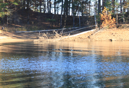
Black and white reference photo.
Except for rare occasions, I don't usually spend much more than about 10 minutes on thumbnails. But whatever the amount of time I take for this planning stage, I've found that it's time well spent to determine what I want to say with the painting, and what will make it artwork rather than a copy of a photograph.

Monday, October 8, 2012

Colorful Underpaintings in my Monday Class

November Marsh, pastel, 9x12
Last week in my Monday class we did a monochromatic underpainting. This week we jazzed things up a bit using a colorful underpainting. While some thought was given to the values initially blocked in for the underpainting, the main goal was to first underpaint colors that would contrast nicely with the colors ultimately layered overtop.

Underpainting for November Marsh
Liquid underpaintings work great to allow you to layer complimentary colors without ending up with mud. When you wet down a color, it becomes a dry surface on which to overlay it's compliment, giving you some nice clean, "sparkly" contrast. Here I used an orange and yellow-orange under the sky and water, and various purples and blue-purples under the yellow-orange hues.

November Marsh is my demo from this morning's class.

Monday, October 1, 2012

Underpainting in my Monday class.

Been Down This Road Before, pastel, 9x12
In my Monday morning class today, I introduced liquid underpainting to some new students in the class. For my liquid underpaintings, I use alcohol over an initial light layer of pastel, which is how I got this painting started.

I used a mostly monochromatic underpainting to set the value structure, using a dark blue Nupastel to block in most of it and a very dark reddish-purple soft pastel to intensify only the darkest areas. Straying a bit from the monochromatic structure, I also added just a touch of a yellow-orange with a Nupastel to the lightest areas (the sky and road). Even for my monochromatic starts, lately I've been including a warm color to underlay my light areas when the ultimate color used in that area will be on the cool side...I find that this keeps the color from have a whitish, chalky look.

Sorry I don't have photos of the initial block in on this one.

Thursday, September 27, 2012

Immersed in Water, Part 2

Late Afternoon Reflections, pastel, 12x9
Late Afternoon Reflections is my demo from this morning's class in which we continued with our water series. Normally I take my demos to about 80 percent completion during the roughly hour and 15 minute demo time during class, and add just finishing touches after the class. However this was one of those demos that I felt the need to fuss with much longer than I like after class. I wiped down the water area more times than I care to admit. It's easy to get caught up in all the "ins and outs" of the ripples in the water when copying too much from the photo...a similar issue I ran into with last week's post on water.

reference photo

I went back and forth with how detailed to make the water ripples, as well as how hard and soft to make the edges. My distant trees seemed to be working with fairly soft edges, so I decided to keep the edges in the water mostly soft, except for a few areas that needed emphasis.

Regarding color (also part of my issue last week), I had to search for a way to handle the warm, peach highlights in the dark reflections in the water. I finally decided to interpret those warm highlights as more of a soft-edge glow rather than with linear strokes. This helped to give that upper right section of the painting an overall glow with it being placed near the warm, sunlit areas of the land and tree mass.

Still not being completely satisfied with this "problem painting," I thought the composition could be better...sooooooo...

Late Afternoon Reflections, pastel, 8x8

Monday, September 24, 2012

The Tree Portrait

Tree Study, 8x8, pastel
Tree Study is my demo from my Monday class this morning. The focus was, obviously, on trees, or what I like to call a "tree portrait." Normally when I do this exercise, I choose a scene that has one main tree and then a few others around it. The challenge is then to use color vibrancy (bright/saturated vs. grey/muted) and color temperature (warms and cools) to bring some sections of tree foliage forward and push others back. Soft and hard edges also play a part in all this.

We also discussed creating the overall shape of the tree, creating pleasing abstract shapes, rather than creating an exact copy of the shape as shown in the reference photo.


Thursday, September 20, 2012

Immersed in Water

Dancing on Water, pastel, 9x12
In my Wednesday and Thursday pastel classes, our focus for the next couple of weeks will be water and water reflections. I found a reference photo that I thought would make a great study for colorful water reflections. Well, it seemed like a good idea at the time. You'll notice in the reference photo below that there's a brilliant blue reflection that I thought would make for some wonderful, colorful reflections to paint.

reference photo
Often what makes for a beautiful, interesting photo, doesn't always translate well into good artwork. After some struggle with my demo (on both days!) I realized that focusing too much attention on the big blue mass in the lower half made the painting bottom heavy and split the composition into two unrelated sections. The blue reflection as it appeared in the photo just didn't seem to translate well as artwork when I tried to copy what I saw. So that's where artistic interpretation had to step in and work the same excitement from the brilliant reflection into a logical composition, and also work with the established color palette.

Dancing on Water is my demo from my Thursday class.


Monday, September 17, 2012

Minimal Stroke Exercise - Sept. 2012

Across the Lake, pastel, 7x5
I try to revisit this exercise often in my classes, especially when I have beginners in the class. As frequently as I've done this with my classes, I believe that it's just as valuable to me as it is to my students, since it reminds me to think twice before I put pastel to paper whenever I complete these demos. Far too often, I want to finish a painting quickly, or I just get lazy, and don't put enough thought into each and every stroke...the direction of the stroke, how I'm holding the pastel, and how hard or soft I should be applying the stroke: these all will affect the look of your painting.

To see an earlier post of a previous minimal stroke exercise for more details on how I go about this in my classes, click here:  http://barbarajaenicke.blogspot.com/2012/01/creating-pastel-painting-with-minimal.html

Thursday, September 13, 2012

Making Photoshop do the squinting for you, Part 2

The Light Beyond, pastel, 9x12
This week in my classes we worked again from a blurred photo for the beginning stages of the painting. With a mass of busy tree foliage from this week's subject matter, this little trick helps to simplify all those tiny leaves into the large shapes that need to be blocked into the painting first before fussing with any details. (To see what we did last week with "boats" that were chock full of little details, click here: http://barbarajaenicke.blogspot.com/2012/09/making-photoshop-do-squinting-for-you.html.)

blurred reference photo
original photo
For this painting, I actually worked much longer than I thought I would from the blurred photo. I thought it had enough information in it, and it already had a painterly feel to it. I felt that the original photo contained more information than you'd want to include in a painting, but I referenced it just a bit at the end for some highlight details.

Sorry, no step-by-step photos on this one, but my post from last week's class with the boats (link above) features demo photos.

Monday, September 10, 2012

First Day of the Fall Session at Spruill

"Sun and Shade" pastel, 9x12
When I have several new students in a pastel class, as I usually do at the start of a new session at the art center where I teach, I find it best to gear the first class toward this group. New pastel artists typically begin with a small supply of pastels and the cheaper paper. I can't blame them...the good stuff is expensive! And if they're just trying out a new medium, who wants to spend a fortune on art supplies when you're not sure if you'll like it.*

So I try as much as possible to use the same supplies that they'll probably use on their first day. My "day 1" exercise: working from a black & white photo. This helps diminish the frustration of trying to match exact colors in a reference photo, and focus on seeing the color pastel sticks in terms of values.

reference photo
My demo was done on Canson Mi-Teintes paper starting with three Nupastels and a Rembrandt or two, followed by 12 softer pastels.


*I should add that I do encourage my new students to gradually try the better pastels and surfaces, since for some artists, the better quality materials can make all the difference with whether they like the medium or not.

Thursday, September 6, 2012

Making Photoshop do the squinting for you.

Retired, pastel, 9 x 12
Most artists know all about squinting. That's how we simplify what we see in our subject matter in order to edit unnecessary details from our painting. Some days I feel like it gives me a headache when I do lots of squinting. And I'm certain that it's speeding up the formation of crows feet around my eyes!

So I thought I'd try a little trick in Photoshop to create as close as possible how I'd see a photo if I was squinting at it. Now I'm no expert in Photoshop, but I played around with all the tools I could find that blur a photo and reduce details.

 My blurred photo.
My original photo.
I chose these boats for the subject matter when I used this exercise in my classes this week, since they have lots of details that tempt artists to capture right away. I had students work from the blurred photo to get the painting going (especially for the underpainting) so that they couldn't even see many of the details. After the initial stages of the painting were underway, we traded the blurred photo for the real photo and added the finer details in the later stages.

Below are a few shots from my demo that I did in my Thursday class this week. I started with some warm hues using Nupastels, and then used an alcohol wash (I use a stiff bristle brush for this). It's on Uart 400 grit mounted to acid free foam board.