Saturday, December 21, 2013

Holiday Greetings...and a BIG THANK YOU!


A heartfelt THANK YOU to all who have taken classes and workshops from me and who have purchased my work. I feel honored and blessed that I have the opportunity to share my passion for art with all of you in this way, and to have established such wonderful friendships with so many of you. 

I've appreciated all of your comments on my blog, Facebook, etc., and it's always a thrill when I have the opportunity to meet some of you in person! With a busy workshop schedule that will take me all over the country in 2014, while continuing to teach both pastel and oil from my studio in Roswell, GA, I hope to cross paths with many of you again. 

I wish you all a joyous holiday season and much happiness in the New Year!

Sincerely,

Barbara Jaenicke
www.barbarajaenicke.com

Friday, December 6, 2013

The Grays of Winter - pastel

Along the Corn Field, pastel, 8x10

I had students tackle winter grays once again, this time with pastel for today's class. (Yesterday's class was the same topic but with an oil demo.)

Again, the discussion centered on scrutinizing the subject matter to determine the warm grays from the cool grays in both the darks of the trees and the lights of the snow. For the corn field, it was a balancing act of the warms with the cools as well, realizing that the color choices made for this area needed to be much more subdued that you would initially think, since it's within the context of very grayed colors surrounding it.

The value shifts that were needed to capture the small amount of light streaming from the right side were subtle, but important to show accurately.

Below is the underpainting I used to get things started:


For anyone who's worked in both pastel and oil, you quickly realize the pros and cons for each medium. Big upside for oil: you can mix lots of grays with only a few tubes of paint. With pastel, if you don't have many grays and neutrals in your supply of pastels, they're difficult to achieve by graying down brighter colors. (This is certainly possible to do by visually mixing compliments, but more difficult to keep clean color in the painting using this method.)

New students (or students who don't yet have a good range of colors and values in their supply of pastels) often experience frustration when they realize they're missing these key color options. I've wondered if I need to stick with class exercises that steer clear of these colors that don't usually come in basic sets. However, I think it's important to still include this topic because it helps students realize how critical the use of grays and neutrals are to a successful painting, and also helps them to know what they'll eventually need to add to their supply when their budget allows.

Next month in my studio classes, we'll explore the sunnier side of snow!


Thursday, December 5, 2013

The Grays of Winter - oil

Hidden Creek, oil, 8x10

Many artists love to paint because they love color. However, learning to handle grays is a key skill.

With today's class, I demonstrated from a reference photo that had lots of gray and very little color, but with a little "push" from Photoshop, I was able to very slightly exaggerate what little color was there. And it wasn't so much about figuring out the color that was in the photo, but determining if it should be a warm or a cool. This takes the pressure off of trying to mix an exact color.

Most of my demo was spent talking through the block-in portion (in which I simplified the busy trees into one large shape, plus the snow on the ground, the sky area at the top, and the three creek shapes) and the warms and cools I mixed using only ultramarine blue, alizarin crimson, yellow ochre, cadmium lemon yellow, titanium white, and small amounts of cadmium red light and cobalt blue. Sorry, I forgot to get progression photos, but here's where I left the painting at end of the demo portion of the class:


After the class, I took my time fine tuning and adding the small details.

reference photo


I'm holding class again tomorrow, this time in pastel. Same topic, different snow scene.


Monday, December 2, 2013

Upcoming Workshop at Terry Ludwig Pastels!


Gearing up for my Colorado adventure next month! I'm finalizing plans for my workshop--The Pastel Landscape Simplified--at Terry Ludwig Pastels in Littleton. While I'm out there, I'm hoping to also do a little skiing and plein air painting, so I'm not kidding about the "gearing up" part!

Dates for the workshop are Jan. 24, 25 & 26 (Fri. - Sun.) and the fee is $325.

In my workshops, I lead you through well defined exercises to help you learn or improve very specific skills. The focus for this workshop will cover various approaches to editing the unnecessary details in the landscape and achieving a more simplified, poetic look.

If you're interested, just email me at barbarajaenicke@msn.com for more details and how to register. All payments must be made by Dec. 20, so don't put it off if you want to sign up!

Monday, November 25, 2013

6x6 Show!


For any of my blog readers in the Southern California area, I'm proud to be a part of the 6 Inch Squared Show at the Randy Higbee Gallery in Costa Mesa, CA next month. This is the second year I'm participating in this fantastic exhibit, which is comprised of only artwork that measures 6" x 6."

If you go to http://6inchsquared.dailybrushwork.com you can see the entire show online, and can even purchase work online if you're not able to attend in person.

The show opens Dec. 7 (but you can purchase online now), and runs the month of December.

Thursday, November 21, 2013

Composition and Block In...5 Shapes or Less

A Moment's Peace, pastel, 8x10

I had a packed house at my studio this morning for class. After scaling back my local teaching schedule to one class per month and adding oil painting students, I may have to rethink this schedule. Maybe I'll end up with a happy medium of two classes per month? We'll see.

Today's demo was in pastel. The focus continued with a composition topic, this time using an exercise I revisit often: the Five-shape Landscape. This method of starting a painting is one that has helped me boost my own skills with developing a strong composition and simplifying busy subject matter, so I use it quite a bit with my students.

The objective: divide your subject matter into 5 (and only 5) shapes. To do this, you'll need to combine shapes of similar values. Stronger compositions will typically still have a variety of sizes among the five shapes. And, yes, I still use the old fashioned tracing paper to do this...

reference photo

thumbnails

Using my top thumbnail for placement of my shapes, and bottom value sketch to block in, the starting point of the painting isn't so overwhelming. When starting the painting, I reference my thumbnail sketches, not my photo. I'm only concerned with the placement of my five large connected shapes, and their approximate values.

I managed to snap several progression shots on this one. Although I take great care to place my large shapes exactly where I want them, I keep my edges soft and very loosely defined at this point in order to push and pull them in later stages of refinement. Adjusting values and color temperature on these big shapes is the next task, and then lastly I carefully choose only the details necessary to communicate the mood of the landscape.


Sunday, November 10, 2013

Workshop Wrap-up: Piedmont Pastel Society

Pass the Barn on Your Left, pastel, 11 x 14


This past week I had the privilege of conducting a workshop for the Piedmont Pastel Society in Charlotte, NC. In the four-day workshop, I had students focus on a specific challenge each of the four days: basic composition development, the "five shape landscape," minimal stroke exercises, and limited color palette working from a black & white photo.

Below is from the first day of the workshop, when I introduced my method for planning out the basic composition for a painting.

Winter Journey, pastel, 12x12


Day two, we took that idea one step further with the five shape landscape...dividing the composition into no more than five shapes to get the painting started. Shown below are the thumbnail sketches, which 
    indicate the inital five shapes, and the underpainting based on the five-shape value sketch.


underpainting for Pass the Barn on Your Left (at top)

  We switched gears on day three to focus on stroke application...an often ignored skill! By counting the strokes applied to a painting, artists are usually shocked to find out how many unnecessary strokes of pastel they otherwise find themselves piling onto their paintings. We also addressed stroke direction and how much of the pastel stick we want to have touching the surface for different types of strokes. Even though this workshop focused specifically on landscapes, we warmed up with a 20-stroke apple exercise, since an apple is a simple, recognizable shape in which we could focus on strokes rather than copying from a photo reference or an actual apple. (The top two apples painted in 20 strokes each; the bottom one was fine tuned after the 20 strokes.) We then moved onto small landscapes, working to about a 6x8 size, completing these studies in 100 strokes or less.


Although during the first three days of the workshop I made mention often of how I go about choosing my color palette, on the fourth and final day, that was our focus. By working from a black & white photo and limiting the palette to no more than 20 pastels, we used values and color temperature to develop a harmonious color palette for the painting.


Unknown Journey, pastel, 11 x 14

black & white reference for Unknown Journey

This was a fantastic group of 18 motivated artists, and I thoroughly enjoyed the opportunity to work with each one. I was also given the honor of judging this pastel society's exhibit, which included some amazing work. The past week was certainly a case in which the instructor/show juror left feeling just as inspired as the attendees! Thanks, Piedmont Pastel Society!


Saturday, November 2, 2013

Composition and Block In

Leisurely Drive, oil, 8x10

Just this past week I began including oil painting students in my class that I teach at my studio, which used to be strictly a pastel class. Now it's a combined oil/pastel class. And if it works out well this way, I'm hoping to alternate pastel and oil demos for each class, which I now hold on a monthly basis.

For this past week's class, my demo was in oil, and the focus was on constructing a value thumbnail and basing the block in on the value thumbnail. Although my demo was in oil, my pastel approach is done much in the same way.

Whether it was from having new students in the class, concentrating harder on doing a demo in oil, or just my awful memory, but I forgot to photograph my initial block in. Yes, as I mentioned, that was the focus of this class...and I forgot. Sorry.

But I do have my initial sketches to show...


The thumbnail sketches are what I find most students avoid. But these serve as my road map to find my way into the painting. The top one is how I divide up the placement of each element. Since I use tracing paper for my sketches, I place the paper over my photo and shift each element to it's most ideal placement. Also, I can more easily see if any element will fall along either center axis, and if it does, I move it to a better spot. In the bottom sketch, I grouped shapes into about 5 values, combining as many shapes and values as possible.

reference photo
As my painting progressed, I found that I did have to lighten the foreground trees on the left (compared to my value sketch) to give it a more "light filled" look.

Monday, October 28, 2013

Painting the Autumn Landscape in Pastel

Color Amid the Haze, pastel, 11x14

Autumn Marsh, pastel, 8x10

This past Friday I taught a one-day pastel workshop here in Atlanta. The topic was painting the autumn landscape. Autumn is probably my favorite season. I love the crisp, cooler air, the smell and crunching sound of falling leaves, and of course the beautiful colors.

I have to admit that when I first started painting autumn landscapes years ago, I went a little overboard on the color. I look back at this earlier work and feel like I need sunglasses to view it. I hadn't yet learned how to balance my vibrant autumn colors with the necessary grays and neutrals that make the more vibrant colors "sing." I also hadn't yet purchased the necessary pastels in these duller colors. These crucial grays and neutrals aren't the "pretty" colors that we pastelists normally gravitate toward.

One of the most important aspects of color use that I've learned over the years is that, more often than not, the best color for almost any particular area of a painting is usually duller than I first think to select. Learning this balance of color intensity for the various areas of the landscape is, I believe, one of the most critical concepts for any artist to learn.

For my two demos I painted for this workshop, I selected one cloudy day scene and one sunny day. Notice how there's more of a contrast between color temperature (dull vs. vibrant) in the cloudy scene (top) compared the sunny scene in which the color temperatures are still varied but to a lesser extreme. Often, the color on cloudy day scenes may actually appear more intense because of this more extreme contrast.

If you're having trouble with overly bright, garish looking landscapes, as your budget allows, you may want to invest in some sets of gray (not pure gray, but grayed colors) or neutral pastels. Many pastel brands offer such specific sets.

When I work with beginners who usually have basic starter pastel sets, we run into the challenge of having very few of those crucial dull colors. Yes, you can visually mix colors from a basic set (i.e., mix complimentary colors for a grayed effect"), but the result isn't as clean of a color application as if you apply the precise color you need. I never like having to tell new students that they have to buy more pastels. But thank goodness many of the pastel brands out there today offer the option to purchase single sticks a little at a time for those of us on a budget!

Friday, October 18, 2013

Strokes and Edges


October has been a hectic month, with November getting even a little crazier with lots going on in my schedule (all good stuff!), so this will be a short post. Just thought I'd share some demos I painted for a couple of private classes I held this week. Both were for experienced pastelists who wanted to work on some specific skills.

The demo at the top was based on a timed study. In our last session, I worked with this student on a minimal stroke exercise, and this week we worked from the same photo but gave ourselves a time limit of 30 minutes (after the underpainting was established) for an 8x10. I fined tuned my demo about another 10 minutes afterward. The objective was to start with a strong underpainting and use deliberate stokes sparingly without overworking.

reference photo for above demo

For the demo below, the primary topic was edges...hard, soft, disappearing. Over defining the subtle is often a stumbling block for many artists. Backing up from your work is one of the best ways to notice if you're over defining your edges, although many artists forget to do this. Edges often look soft up close but may actually be more defined that you think. Snapping a quick photo on your phone and viewing a shrunk down version is also a good way to check.


reference photo for above demo

Both demos were done from the student's photo.

Thursday, October 10, 2013

One-day Workshop: Painting The Autumn Landscape in Pastel

Autumn Splendor, pastel, 11x14

The image shown here is from a demo I painted a couple of years ago. The topic was actually regarding edges....more specifically, exaggerating hard and soft edges. However, it's become one of my favorites because of the color palette.

Autumn colors can often tempt the artist to overdo the vibrant colors that we find so appealing, resulting in a very garish color treatment. Knowing when to use those "brights" and when to tone things down is key!

Painting the Autumn Landscape in Pastel

Friday, Oct. 25, 2014
10 am - 4 pm
Spruill Center for the Arts, Dunwoody, GA
www.spruillarts.org

If you're in the local Atlanta area, I'll be teaching a one-day workshop on "Painting the Autumn Landscape in Pastel" on Fri., Oct. 25 at Spruill Center for the Arts in Dunwoody, GA. The details are on my website or at www.spruillarts.org. (Note: there IS a supply list for this workshop. The Spruill website may not be showing it. Just contact me for the list if you plan to register and the list is still not appearing the website.)

If you've been following my blog and are accustomed to seeing a weekly post regarding my classes that I teach locally from my studio, please know that I'm still teaching and plan to continue my posts. However, with a growing out-of-town workshop schedule, I'm needing to cut back on my weekly classes in order to have the time to prepare for my workshops and also have enough studio hours to produce work for galleries and shows. My local classes from my studio (which will now include oil as well as pastel!) will now be held once per month. Therefore, my future blog posts may not be every week, but possibly once or twice per month. Hope you'll continue to follow my posts!

Thursday, September 26, 2013

The Minimal Stroke Exercise...It's Back!

Tunnel Through the Trees, pastel, 8x6

In today's world, we live in a society in which we don't like being told we have a limit. We love phrases like "unlimited minutes" and "unlimited miles." But of course, sometimes too much of a good thing can be bad. And even the newest pastel artists quickly find out that too much pastel pigment on a surface is usually a VERY bad thing.

I like to revisit this exercise with my students every so often. It's a great one to do with both beginner and experienced students. Not only do I always get positive feedback from students about how helpful it is to them, but I find it to be a great exercise for me personally. For me, doing these exercises reinforces the importance of economizing every mark that I make on a painting. Each extraneous, unnecessary stroke on a painting weakens the impact of the work.

The above painting is a completed piece that was begun as a 100-stroke demo. Below is how it appeared after 100 strokes (okay, it may have been around 105)...


The completed version was with a total of about 5 more minutes on top of the 100-stroke exercise.

It was suggested to me to occasionally feature some of my student's work on my blog. Below is today's effort on this exercise done by Judy Tiller, who's been studying with me for a couple of years now. I thought Judy did an excellent job choosing a good combination of colors and accurate values, and capturing the basic elements of the landscape scene with good economy of strokes!

Judy Tiller's minimal stroke painting

Below is the reference photo that my students and I worked from today...


If you'd like more information on this exercise, you can click the following links to previous blog posts on this topic:
Minimal Stroke January 2013
Minimal Stroke April 2012
Minimal Stroke January 2012

Thursday, September 12, 2013

Still Life: Assembly Required

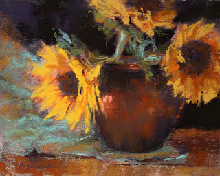
Sunflower Trio, pastel, 8x10

Although I'm primarily a landscape painter, I enjoy painting still life, too. A few of my pastel students sometimes accompany me on weekly plein air outings, but most of my students prefer working from photos. So every once in awhile I hold a still life class in order to get everyone out from behind the photos and work from life.

But there are challenges with doing this in a class setting. If you're limited to the space available in the studio, everyone in the class will need to huddle around one still life setup. And no one person (except the instructor who set it up) has control over the placement and lighting of the still life objects. Basically, you get what you get from where your easel is set up. That's the case in my studio where I hold classes. In other art centers where I've taught, I've had the use of larger studios and the ability to provide each student with their own space to set up their own still life objects, but they still needed to share lighting.

I personally feel that it wasn't until I started composing my own still life set ups that I really could do this type of work to my satisfaction. Maybe it's the control freak in me, but there's nothing like having total control over the objects selected, surface, background, arrangement, and the all important LIGHTING.

So for this week's class, I held a "demo only" class and went over what to consider when getting a still life set up...encouraging my students to put these ideas to work at home, where they can take advantage of that "total control" thing.

Before we got to the topic of lighting, we discussed still life composition and decisions that need to be made up front which will affect the composition. One such decision is at what level in relation to the viewer's eye to place the arrangement (overhead view? eye level?). As a landscape artist, an equivalent decision I usually make up front before painting a landscape is regarding a high horizon vs. a low horizon. Shadows and reflections (and composing these elements) as an integral part of the composition were also discussed.

I tend to approach still life in a similar manner to plein air painting. I use a viewfinder to help me determine where to crop. I also make use of the camera on my phone to snap a quick shot and quickly review various ways to crop. For plein air painting, I use both of these tools. With using the camera snap shots, I can quickly flip through the various compositions and see which ones work better than others.

On to lighting...I've noticed that many accomplished still life artists tend to arrange their subject matter within a controlled lighting environment; either some type of enclosure or area in their studio in which they can block out or direct controlled lighting.

Below is my very crude attempt at creating a still life environment. If I were to begin specializing more in still life, I have to say that I'd certainly want to improve upon this. But the objective here was to more carefully control and direct the light source and enhance/darken the shadow areas. Without an enclosed area, the area in which the objects are placed receive too much light from various areas of the room. Another option is to darken the entire room, but in my studio during the day, too much light comes in through the windows. After I got going with my demo, I wished I extended the dark cloth on all three sides in order to darken the shadow areas some more. Like any other genre, it takes practice in order to master the subtleties of setting up a still life. The best still life artists are able to create a sense of drama with the ability to get focused lighting exactly where they want it. And many still life artists take as much (or more) time composing their arrangement as they do painting it.


But for the purposes of today's class, the goal was to simply inspire my students with a few ideas to work from life at home. Hopefully they'll all do their homework!


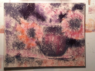
A preliminary block-in for Sunflower Trio.

Saturday, September 7, 2013

Workshop Wrap-up - The Art Loft, Dahlonega, GA

Shady Refuge, oil, 8x10

I just spent a fantastic two days with a wonderful group of artists in Dahlonega, GA teaching my "Composition Boot Camp" workshop at the Art Loft. Anita Elder, who owns and runs the Art Loft, does an incredible job taking care of students and instructors, making sure it's an excellent experience for everyone! The workshop was open to oil painters and pastel artists, so I demonstrated in both media.

Directly above and below are my demos from the workshop. They were both started as "block-in" demos working from thumbnails (see below), completed later after the demonstration time.

Resting Place, pastel, 6x12

Thumbnails were a big deal in this class. Students had to first develop several thumbnail sketches for each painting according to a list of composition guidelines that I suggested, and then take a small painting only to the point of blocking in the composition, working from one of their thumbnail sketches. By the end of the workshop, students ended up with lots of sketches and several starts to small paintings in which they carefully planned every shape within the composition. (No details allowed!)

The students in the class and I all agreed that the next time I teach this workshop, I should use a timer for the thumbnails and the painting block-ins. This would better encourage focusing only on the big shapes and prevent the tendency to want to labor over details.

Below are examples of my thumbnail sketches, and the block-ins that I demonstrated from one of the thumbnails for each.


My next couple of workshops on the calendar are pastel workshops. One in Charlotte, NC for the Piedmont Pastel Society, Nov. 4-7 (this one is full with a waiting list), and then in Littleton, CO at Terry Ludwig Pastels, Jan. 24-26, 2014 (a few spots still left in this one). You can see the full schedule on my website at www.barbarajaenicke.com.