Friday, February 25, 2011

Road May Be Slippery

Road May Be Slippery, 12 x 16
I was going after drama with this piece.  To achieve this, I used a high horizon, angled lines, and bold contrast with both color and light.  When planning out my composition, I took a little extra time to carefully place all of my angles.

I normally don't include items such as telephone poles in my paintings, but I thought their placement here would be a great way to create more depth in the piece, adding to the drama.  I added those last, and it really did make  big difference with increasing the feeling of distance of the painting. 

Tuesday, February 22, 2011

Autumn Trees Aglow

Autumn Trees Aglow, 9 x 12
In my most recent weekly pastel classes, I had students start a painting from a photo that was manipulated in Photoshop to exagerate the contrast.  In the high contast version of the photo, the image gets divided into 3 - 4 values, making it easier to block in large areas of distinct values.  This technique doesn't work for all photos, but is sometimes a helpful technique to use in the initial stages of the painting when working with busy subject matter, such as large areas of tree foliage.

I also wanted to try my hand at using harmonious colors (see posting below) in this piece.  I must say, that's actually easier to do in oil!

I started two very similar demo versions of this painting...one in each of my pastel classes.  I only had time this past week to finish one of them.  (But I'm not telling either class which one I finished. ;-) )

Trees on the Chattahoochee


Trees on the Chattahoochee, oil, 8 x 10
 One of my goals this year is to become more skilled in oil, and eventually be equally skilled in both oil and pastel.  I recently took a workshop with Bill Davidson and tried to put my newfound knowledge from the workshop to use in this little 8 x 10 piece. Mixing a color palette has been my weakness when working in oil.  We pastel artists are quite spoiled having all the colors right there ready to go. But I'm learning that with mixing a palette, it's much easier to keep all colors in a painting more harmonious by keeping certain colors common in each color that's mixed.  With a large supply of pastels from which to choose, it's too tempting to throw in every color we have, often ending up with a very unharmonious colors, or just plain mud.

Tuesday, February 8, 2011

Tea Time


Tea Time, 9 x 12
  It was "still life" week in my classes recently, and our focus was on edges.  I find that the most dramatic, eye-catching artwork makes good use of hard and soft edges, and disappearing and reappearing edges.  Artwork that attempts to equally define every element loses its impact when everything in it is fighting for attention.  Good artwork needs places for the eye to rest (the soft and disappearing edges) in order for the more exciting areas (the hard and reappearing edges) to gain attention.

I think still life studies are a great way to learn this concept before applying it to landscape work. With most still life subject matter, there's not very much depth to work with; most items are usually at a close viewing range.  You have to really work at seeing the more important vs. less important areas.

Looking at this image of the finished piece, I'm feeling a little daring and am thinking of going back to it and doing something crazy with the background. There's a good chance I may end up destroying it (as I many times do when I get these crazy urges).  But without the confines of the original scene in front of me, I can simply think in terms of making a dramatic piece of artwork with interesting composition, color combinations, etc.  I've learned not to get too attached to any painting so that I can have fun getting a little crazy every once in awhile.

Friday, February 4, 2011

Winter Trees


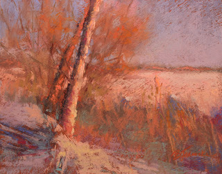
Winter Trees, 8 x 10
 In my two weekly classes, we recently worked on how to depict those challenging, barren winter trees.  I did this quick little study before both classes just as a warm-up for myself and to better explain during my demonstrations how to paint this type of tricky subject matter.  I had hoped to post my finished larger piece that I used for both in-class demonstrations.  But with a week fraught with fraudulent charges on my debit card, helping my 6 year old do a research paper on walruses, and troubleshooting some annoying computer problems, the larger painting didn't survive the distractions and died a slow death.  With a few touch ups to my original study, I decided I liked it better anyway! 

Many artists find that their quick studies sometimes look better than work that received their more careful attention. Why?  I think one reason is because when we work quickly, we use fewer strokes of each pastel stick.  Fewer strokes means fresher, unmuddied color application. Most of us also do a better job of getting down the big shapes quickly without fussing with the details when we know it's just a "practice" piece.  For anyone who's taken my class, you know the importance of big shapes first; details later. This doesn't mean you shouldn't take the time to carefully plan a painting, or that you should always paint very fast. It just means that paintings tend to be more successful when they retain a fresh color application, and that a good artist will know when to skim over the superfluous details and when to slow down and think through the challenging areas.

Just to let you in on a little secret...I actually did an even quicker 5 x 7 study before the 8 x 10 above.  So I did already solve a few problems I had with the 5 x 7 before embarking on this one.