Thursday, January 31, 2013

The Many Colors of Snow, Part 4

Winter Light Fading, pastel, 8x10
I had thought this series on snow that I've been doing with my pastel classes would be a three-part series. However, everyone seemed to be enjoying painting snow (including me!) and I had this reference photo that I thought would make an excellent exercise in value and color temperature. Almost all of the snow shown is in shadow, forcing you to ignore the logic which tells us that snow is white and typically appears as a light value.

In today's class we discussed how we needed to somehow show lots of warm colors in the distance, because that's where the direct sunlight was hitting, and cool colors in the foreground, since that area was entirely in shadow...which is the reverse of how we typically handle the placement of warms and cools.

Fortunately there are other artistic "tricks" we can use to depict depth in a painting, besides relying only on warms and cools. With today's painting, I used careful placement of hard/soft edges and increased the vibrancy of the foreground blues. I also used a mix of warms and cools in the distance and the foreground.

The narrow sliver of sunlit snow in the distance (the lightest value in the painting) gave us a great benchmark to contrast the value of the snow in shadow to the snow in sunlight.

Below are a few demo shots of how I got this one going...


Thursday, January 24, 2013

The Many Colors of Snow, Part 3

Wintry Dusk II, pastel, 8x10

Wintry Dusk II is my demo from my Thursday morning class. This week our snowy subject matter had low light conditions, which presents us with several challenges, especially when working from a photo.

First, without direct sunlight, there's very little definition of values or color in the snow. Add to that what the camera obscures. Even with the low light, the scene is basically back lit, which throws the trees into darkness, causing them to appear very flat and darker than they are. If you paint them like that, they'll appear cut out and pasted onto your painting. The camera will also usually exaggerate the contrast under this type of lighting, not only darkening the upright objects (trees) but overexposing the whites (snow) which tends to eliminate what little definition in the snow there may have been. So my first job is to see what adjustments I can make in Photoshop to correct these problems...


Above is an uncorrected photo. I forgot to save the original version of my actual reference photo, but this is from the same general area. (You get the idea.)


Above is my reference photo after I made some adjustments in Photoshop. I'm no expert in Photoshop, and there are probably a variety of ways to make this adjustment, but you basically want to decrease the amount of contrast, which will bring the values of the darks and lights a little closer together (i.e., lighter trees and darker snow) sometimes allowing you to see just a bit more definition in both of these areas.

With very little definition to begin with in the snow, I used a mix of warms and cools in the correct value, which needed to be darker than one would think, since most of the snow was in shadow. The small amount of snow just beyond the foreground trees reflects more light from the sky overhead, making it appear lighter in value.

Besides the exercise in painting snow, this one was also quite the workout for creating skinny tree branches. When leafless trees are further in the distance, you generally mass in the tiny branches with the appropriate value, without depicting every little branch. But when they're in the foreground, you do need to render many of them. Practice with the various edges of your pastels is key here...whether rolling a round, crisp edge to form a wispy branch or dragging a pastel stick lightly across the surface, knowing how to handle the application of the pastel simply takes practice. I suggest to my students practicing on a piece of scrap paper until you can find the right edge and "touch" to create the mark that depicts the size and shape you need.

Below are some progression shots of this one...

Block in with Nupastels.

Alcohol wash.

Placed in only the largest tree at this point.

Added the thinner trees once the areas behind were in place.
Wintry Dusk II (completed)
After looking at this again, I'm thinking my sky should be a little lighter, especially at the horizon. Below is my same demo from my Wednesday class. I like the one below better...the tree values are a little more accurate.

Wintry Dusk I


Wednesday, January 16, 2013

The Many Colors of Snow, Part 2

Heading Somewhere Warm, pastel, 8x10

We're into the second week of our snow series in the classes at my studio. This week we addressed overcast, flat lighting. This is a challenge on the eyes, especially working from a photo taken with my phone. I did have the advantage of having painted this same scene briefly on location, which helped to explain some of the small value and color shifts not readily noticeable in the photo.

The best way I found to approach this type of lighting situation, especially when working from a photo, is to use what you already know about values and color temperature to further define what's not evident in the photo. For example, your values should diminish (lighten) as they recede...more so in very overcast, moist conditions. Photos (especially bad photos) won't always give a true representation of this. The snow will be warmest where light is hitting it directly, but also sometimes has a tinge of warmth in the distance. And even with the flat light of the overcast conditions, the snow still has reflective qualities that call for combining warms with cools.

There are indeed value shifts in the snow here, but very minor ones...the hard part is keeping the overall high contrast look of the trees against the snow and sky, with only very subtle value changes in the snow. Lots of hunting through your pastel box is normally required for just the right combination of values here!

Below are some demo shots of how this one came together...


I used four Nupastels in different values to block in the major shapes and values. Since high contrast values were important here, I wanted to get that started in the underpainting. I used a warm pink and lavender in the snow, since I would be overlaying much of that area with cools. I would be able to use the warms of the underpainting to peek through and provide some nice contrast of color temperature.


Alcohol wash to set the base underpainting in place.


Heading Somewhere Warm was painted on mounted Uart 320.

Monday, January 14, 2013

Making Your Mark

Springtime Marsh, pastel, 5x7

This morning I was working with some students who are new to pastel, and demonstrating one of my typical minimal stroke exercises. I've learned that it's important to explain to newer students some mark-making particulars that experienced pastel artists tend to take for granted. However, some experienced artists often still become frustrated when they SHOULD be addressing these particulars (myself included!).

How are you holding the pastel stick? Do you need to use the entire broad side, just the skinny edge, or a portion of the broad side? How much pressure should you apply for the specific mark you need to make? Do you need to vary the pressure along one particular stroke? Should the mark you're making have a hard edge or a soft edge. Yes, lots of questions before you even touch the pastel to the paper.

Keeping some scrap paper handy (ideally the same paper/surface on which you're working) allows you to test out the particular stroke you need, especially if you need to place it in a conspicuous area of your painting. A painting quickly becomes overworked when you test your strokes right ON your painting rather than on something else first.

100-stroke pastel study, 5x7
The 100-stroke study shown directly above is one of two demos of the same marsh scene I did for my class this morning. The second one (at the top of this post...Springtime Marsh) is the one that I chose to finish up with a few minutes of touch-up time, still trying to keep the freshness of the initial strokes.

Thursday, January 10, 2013

The Many Colors of Snow, Part 1

Off Road Tracks, pastel, 10x8
This week, and for the next three weeks, I'm having my pastel classes paint snow scenes. Each year around this time, I visit a beautiful rural area of Minnesota where I visit family, and return stockpiled with new reference photos of snow scenes. On this most recent visit, I was also lucky enough to paint there on location in the snow several times. It's well worth the many layers of clothing to do this, since there's no other way to accurately observe what snow really looks like under various lighting conditions. Even the best photos can't capture this correctly.

Since I don't get to paint snowy landscapes on location very often, I wanted to be able to share my firsthand observations with my classes while they were fresh in my mind. So snow scenes it is for the next three weeks!

This week our subject matter was under sunny conditions, with bright warm highlights and juicy, bright blue and purple shadows. Below are a few shots from Wednesday's demonstration...


For my underpainting, I used a dark blue Nupastel to lightly sketch in just the light/dark shapes. I wanted to keep things real loose in this part. But admittedly, once I wet this one down with the alcohol wash, it got away from me a bit. I explained to my class that the shadows in the snow were not as dark as the darks of the foreground trees, and I wanted to set that up from the start in this underpainting. Didn't happen here. So I had to be sure to make that right as I proceeded.


As I blocked in each area as a large shape, I determined the color temperature I needed.


The sun was hitting the light areas of the snow directly, so that would need to be warm, but with cools mixed in to give the snow it's reflective quality.


From here, I looked for opportunities to harmonize the colors used throughout, along with putting in some of the finer details such as the grass, thin branches and snow on the trees.

"Off Road Tracks" was painted on Uart 320 mounted to acid free foam board.

Tuesday, January 8, 2013

Delivering the Goods

All packed in and ready for delivery!

This morning I had to deliver a large number of paintings. And I was a little nervous. Not that I haven't transported my artwork in my car before...I've been doing that for years. But this morning I had to deliver 30 paintings to an art center located an hour and 20 minutes away, so I really didn't want to have to make more than one trip. I have an SUV (a Nissan Murano) in which the seats can fold down, so I knew it could hold quite a bit, but just wasn't sure exactly how much it could hold safely.

I normally use large, thick sheets of foam (the kind used in seat cushions) that I place between stacked paintings. It keeps them cushioned and protected from being scratched from other paintings stacked above or below, and it also keeps them from sliding around. With only a few sheets of this foam, I had to augment with other materials.

Luckily I'm a bit of a pack rat with cardboard. I'm always finding uses for it, and so I save those large, flat boxes in which you get pastel paper shipped. I cut those so they unfolded flat and I was able to use them to separate layers of paintings stacked on top of each other. I stuffed rags and small towels between paintings beside each other so they didn't bang together if they slid during a sudden stop or sharp turn. I also placed a thick blanket on top of everything in the back so the paintings on the top layer would have a little bit of weight to help keep them in place.

About 25 paintings comfortably fit in the back part of the vehicle, with about 5 small ones stacked on the floor in front of the front passenger seat. I placed a large sheet of cardboard over the seat and stack of paintings, so that nothing I had on the passenger seat (my purse, etc.) fell onto those paintings.

I received a great suggestion from a Facebook friend on one of my recent posts about using rubber, waffle yoga mats to place between paintings. I'm not familiar with these mats (I really should start doing yoga...keep saying I'm going to!!) but they sound like a great idea for this situation. I'm told they're pretty cheap, too.

Please feel free to post comments with any other ideas for safely transporting artwork in your vehicle.

Tuesday, January 1, 2013

Kicking off 2013 with Classes & Workshops!

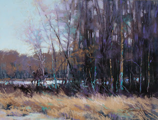
Just Me and the Trees, pastel, 9x12

With my first blog post of the new year, I thought I'd try a new look for my blog design. Hope you like it!

Shown above and then at the bottom of this post I've included a few demos from last year's pastel classes. As many of you know, I LOVE teaching! I teach primarily because I enjoy the interaction with other artists and sharing the knowledge that I've learned in my own journey. In my younger years I never thought I'd have an interest in teaching, but now I can't imagine not teaching.

I always appreciate the feedback I get from those who take my classes, and I hear many times that students like the fact that I keep my classes very focused on specific topics. This is how I prefer to learn when I take a class from other instructors, so this is how I structure my own classes. This way, when you go into a class or workshop knowing that you should come out of it with some increased knowledge on a particular topic or subject matter, you can better determine afterward if it was worth investing the time and money.

This year I have a busy teaching schedule planned, which includes the continuation of my weekly classes here locally in the Atlanta area (and I've recently added a Tuesday evening class at my studio in Roswell!), but also includes a few more workshops outside my local area...

Weekly Pastel Classes

My weekly classes cover a specific topic or subject matter each week (or for a series of 2-3 weeks).

Spruill Center for the Arts, Dunwoody, GA (www.spruillarts.org)
Monday mornings 10:00 - 1:00 beginning Jan. 7, 2013 for 4 weeks (skips Jan. 21); $100
My classes at this location going forward will likely be either mini sessions (3-4 weeks) or workshops (1-2 days).

Classes at my studio in Roswell, GA
Wednesday & Thursday mornings 10:00 - 1:00
Tuesday evenings 7:00 - 10:00
$35 per class ($25 to view demo only)

I also offer occasional private classes, typically on Friday mornings. (Contact me to inquire.)

Pastel Workshops - "Interpreting the Landscape in Pastel"

My workshops currently take you through specific methods for becoming more interpretive with your landscapes rather than merely copying your reference photos.

Tampa, FL - February 8, 9 &10, Pastel Society of Tampa Bay; $295
New York City - March 15 & 16; Pastel Society of America; $250
Gainesville, GA - March 21 & 22, Quinlan Visual Arts Center; $250

Plans for more workshops in 2013 are pending and may be added to the schedule!

Evening Shade, 8x8 pastel

Evening Shade and Just Me and the Trees (at top) are examples of demos in which we worked from black and white photos in order to focus on seeing values more accurately. This exercise also allows you to more easily work with a limited color palette which ultimately enhances the color harmony.

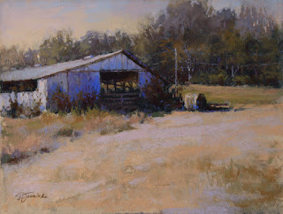
One More Hay Bale, 9x12, pastel

One More Hay Bale was a paint-along demo for a private class in which we focused on developing a specific limited color palette from the start.


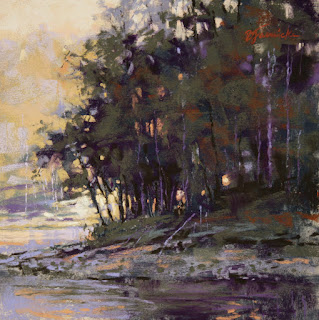
Creekside Glow, 11x14, pastel

Creekside Glow was from a 2-day workshop. I try to include a few specific topics (but not too many!) in such a short workshop. For this demo, I went through my thumbnail process of simplifying busy subject matter, such as a large area of trees/foliage, focusing mainly on creating 3-4 value groups and using color temperature to move areas forward and backward.


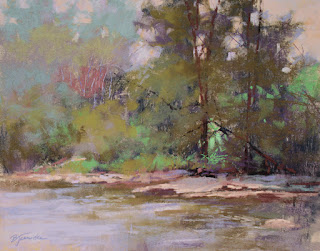
Afternoon Glow, 8x10, pastel

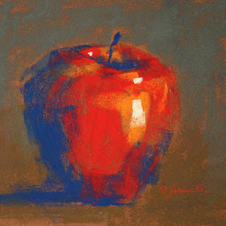
minimal stroke apple study, 6x6, pastel
Afternoon Glow and the apply study are examples of minimal stroke exercises that my students (and myself!) have found extremely helpful in boosting skill level. In these exercises, we not only count the number of strokes, but also address how to apply each stroke (i.e., how you hold the pastel stick before placing it on the paper, how much pressure to use, etc.).

Other topics I often cover in my classes are edges, underpaintings, approaches to thumbnails, using Photoshop to manipulate reference photos, and various others. But I try to come up with new approaches all the time, so who knows what I'll come up with this year!

See my website at www.barbarajaenicke.com for more details and please feel free to contact me at barbarajaenicke@msn.com if you have any questions about my classes or workshops.