A workshop student once asked me why some artists study
painting for decades but never seem to improve. It’s a good question.
There comes a point for every painter when you have to push yourself
into a mentally challenging state and force yourself to figure out the
solutions to difficult painting problems. I sometimes hear people say that
painting is relaxing. Personally, I don’t find it relaxing at all. That’s not
why I paint. I paint because I enjoy the elation I feel when I’m successful at
capturing the visual excitement I want to communicate in a painting. There are other things I do to relax…read, go
for a walk, watch a movie. When I do those other things, I’m not taxing my
brain to scrutinize and search, which is what I do constantly when I paint. For
example, I work my initial composition like some people work a crossword puzzle
or Rubik’s Cube, pushing myself to search for the most ideal design. I also continuously
compare subtle differences in value, temperature and chroma and translate that
into specific color choices. I hunt for those accurate choices, and I continue
to do so until I find what works, constantly scrutinizing, comparing and
observing. These are just some of the many mental gymnastics I encounter when
painting. When I finish a day of painting, I’m more mentally exhausted than
physically.
I believe it’s when people hit the painful threshold of
having to really look and really think and figure it out, that they often push back and simply paint in such a
way that merely takes a wild guess at what’s needed in each area of their
painting. When I get tired or lazy, I usually fall into this trap and end up
with a failed painting. But when this less attentive approach becomes the norm
for an artist, there’s rarely any significant skill level improvement,
regardless of how many years take place at the easel.
It’s only the artists who take what they’ve learned (through
classes, workshops, books, videos, etc.) and practice those skills at their own
easel, using their years of easel time efficiently to push themselves through
that painful threshold, who ultimately increase their skill level much more
dramatically.
This leads to another question that frequently comes up in
workshops: Why are there usually more
women than men in most workshops? I’ve heard various reasons for this,
which I’m sure all contribute to why this happens. I have a particular theory,
though, that I believe largely contributes to this imbalance. This is of course
a very broad generalization, but it
seems to me that typically men like
to figure things out for themselves, and women like to ask for guidance. You
know, that stereotypical situation in which a man and woman are lost while
traveling by car and the woman wants to stop and ask for directions while the
man insists that they’re not lost and he’ll find the way. (Okay, we all have
navigation systems in our cars or on our phones now, so this is sort of an
old-fashioned stereotype, but you get the idea.)
With learning to paint, you actually need both of those approaches: Guidance to
point you in the right direction, and then plenty of your own practice time figuring
it out for yourself at your easel. Again, keep in mind I’m generalizing here
(so, please, neither gender should
take offense!), but I believe women err on the side of asking for help before
trying to figure it out themselves, and men err on the side of wanting to
figure out all of it by themselves without any help.
Well, you know what? You’ll actually become a better painter
if you spend the majority of your painting time pushing yourself to figure out difficult
painting problems yourself. Yikes! I
hope I didn’t just talk myself out of a job as a workshop instructor! The truth
is, you certainly don’t want to paint in a cocoon, especially if you’re still
mastering some basic skills. You DO want some guidance and firsthand
instruction so you can recognize the painting problems that you need to figure
out on your own and be better equipped to handle them. But you also want to avoid jumping from workshop to workshop
too frequently, hoping that this influx of constant spoon-fed instruction is
going to make you a better painter. And you don’t want your only painting time
to take place in instructional settings.
I realize that there’s also the comradery aspect of taking frequent
classes and workshops, and it’s not everyone’s goal to push themselves in this
way. And that’s fine. When I teach my workshops, I make sure to remember that
some artists just enjoy attending painting workshops with other artists and
talking art, and I strive to make it an enjoyable experience for all who attend. But for those artists
who do have ambitious goals, the real work comes after the workshop.
My 14-year-old son is taking piano lessons. When I asked him
recently some specifics about his weekly lessons, he told me very matter-of-factly
that in his lessons his teacher basically instructs him on how to practice. Learning to paint works the same way. Now, if I
could just get my son to practice more!
###
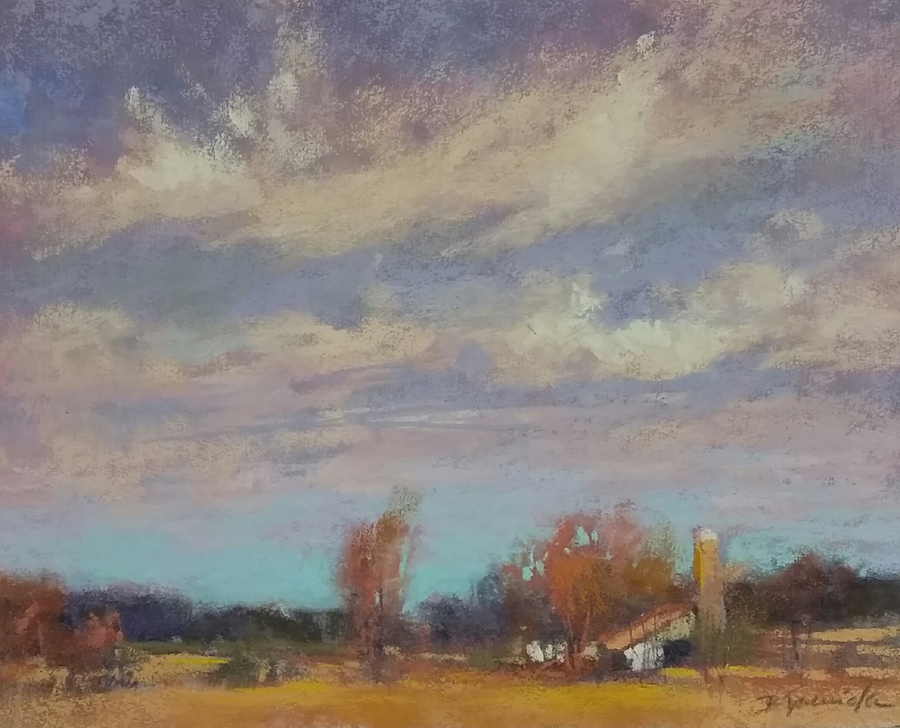
A couple of warm-weather paintings recently off the
easel….
 |
| Alive!, 18x24, pastel |
 |
| Rock Pile at Smith Rock, 14x11, oil |
Upcoming Workshops:
White Bear Lake, MN - 3-day PASTEL/OIL
workshop
August 14-16, 2018
"Landscape
& Light"
White Bear
Center for the Arts
$475/member;
$570/non member (A discount is available for first-time students at this art
center.)
Mount Vernon, WA - 3-day PASTEL workshop
September 20-22, 2018
"Painting
Skies, Water & Trees in Pastel"
Dakota Art
Center
$375
Santa Barbara, CA - 4-day PASTEL/OIL
workshop (studio & plein air)
October 9-12, 2018
"Skies,
Water & Trees"
Studio
portion held at a private studio in Santa Barbara, with plein air locations a
short drive away.
$485
Manahawkin, NJ - 3-day PASTEL workshop
November 9-11, 2018
"Landscape
& Light in Pastel"
Pine Shores
Art Association
$205/members; $235 non-members (This venue receives
generous funding for art workshops in their community, and so the workshop price is crazy cheap!!! If you live in the area and have wanted to take a workshop with me, this is the place to do it!)