 |
| Everything Has Its Place, pastel, 9x12 |
While it's certainly best for the landscape artist to spend lots of time painting on location, we still need to spend time in the studio as well, where we can slow down a bit and experiment. So when we do work in the studio, it's important to have good reference photos from which to work.
As I look back over photo files from many years ago, I can see that I've become more discerning about what types of landscape subjects work well for my paintings, and which ones don't. A good reference photo doesn't necessarily require expert photography skills. It just needs to meet certain criteria. Here's a list of what I look for:
1. COMPOSITION - A variety of large and small shapes, possibly with some depth between the shapes. You can, of course, manipulate your composition to find the most eye-pleasing design of landscape elements (which I always encourage!), but you still need a fairly good arrangement to start with.
2. VALUES - A clear range of at least 3- 4 values, without the shadow areas turning solid black. If you have photo editing software (such as Photoshop) you may be able to bring back those areas by lightening just the shadows.
3. LIGHT SOURCE - Clear directional light and shadow. (This is, of course, not always necessary in situations such as haze, mist, or rain which can also be very beautiful and effective.) Often midday flat light can be tricky to work with from photos, which is why most artists prefer early morning or late afternoon/early evening light.
4. COLOR RELATIONSHIPS - Usually based on sunlight and shadow, a clear indication of warms and cools. Even if the local color of your camera's image is slightly off, as long as the color temperature (warms and cools) isn't too obscured in the photographic or printing process, it will still give you the information you need for a painting. You mainly need to be able to see the warm-to-cool comparisons, even if the color is a tad off. Time spent at the actual location will also help you correct color from memory...I talk more about that in my last post.
During my workshops, I try to spend a good amount of time helping students choose their reference photos, explaining why one would be better than another. Often students make the mistake of choosing a photo based on subject matter, rather than the criteria shown above.
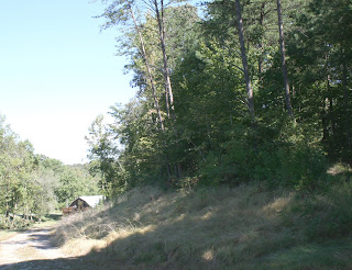
Here are some examples of my reference photos, and why I think one works better than the other:
I used this reference photo above for my pastel painting, "Everything Has Its Place" (at top of this post). It had a good variety of large and small shapes, and a clear range of depth between the shapes (foreground, middle ground and background). The value and color temperature--and even chroma (saturation vs. grays)--in the photo was clear and accurate.
This photo above was from the same location. It has a nice, clear view of the mountains, which is very tempting! But it doesn't have the variety of shapes and depth between shapes that the other one has. It also has a very awkward crop of the foreground tree on the right. It would take lots of guess work to incorporate that tree in a visually appealing way, and would likely need to be left out.
I used this photo (above) for my painting (below).
 |
| Broken Top Mountain From South Sister Mountain, oil, 18x24 |
Below are additional photos also taken at the same location:
Although this photo directly above has a clearer view of the mountain and nice tree shapes, the scraggly tree in the other one above has lots of eye appeal in regard to variety of shapes, edges, values and color temperature. (Lot of great stuff for me to sink my artistic teeth into!) Also, the strong diagonal in photo directly above cuts the composition in half. I might be able to move that a bit, but it might be tough to shift it to an ideal spot and still keep other important elements where they need to be.
This photo below is lacking the variety of large and small shapes, would need lots of work on composition manipulation, and doesn't have much in the way of a foreground.
However, this photo below has possibilities! Good variety of shapes and depth, and good value range.
One more thing to note: In the studio, I work from a back lit screen such as my laptop or iPad, which displays a more accurate image than prints. Even a good quality print often obscures at least to some degree your values and color temperatures.
VIDEO SERIES:
Coming very soon!! (It's almost ready!) To be notified when it's ready for purchase, visit www.paintingthepoeticlandscape.com. (By the way, the painting shown at the top of this post is one of the demos from the series!)
UPCOMING WORKSHOPS:
DEMO AT THE ART LOFT IN DAHLONEGA, GA
The workshop below is full, but we've added a 3-hour oil painting demo on Sun., Sept. 25.
Topic - Painting Genuine Light and Shadow in the Snow Scene
10 am - 1 pm, $50
For those of you in the Atlanta area, it's a very easy drive to get to The Art Loft!
3-day PASTEL/OIL workshop - FULL WITH WAIT LIST
Sept., 22, 23 & 24, 2016 (Thurs/Fri/Sat)
The Art Loft
Dahlonega, GA
$465
Santa Barbara, CA - 3-day PASTEL/OIL workshop (studio & plein air) - FULL WITH WAIT LIST
Oct. 11, 12 & 13, 2016 (Tues/Wed/Thurs)
Studio & Plein Air
Santa Barbara, CA
Contact Kris Buck: 805-964-1464, mbuck18@cox.net
$400
Stevensville, MD - 3-day PASTEL/OIL workshop
November 2, 3 & 4, 2016 (Wed/Thurs/Fri) - REVISED DATES
Chesapeake Fine Art Studio
609 Thompson Creek Rd.
Stevensville, MD 21666
(about 40 minutes from downtown Baltimore)
410-200-8019
$450
Visit my workshop page at www.barbarajaenicke.com for my 2017 schedule.


No comments:
Post a Comment