Monday, October 28, 2013

Painting the Autumn Landscape in Pastel

Color Amid the Haze, pastel, 11x14

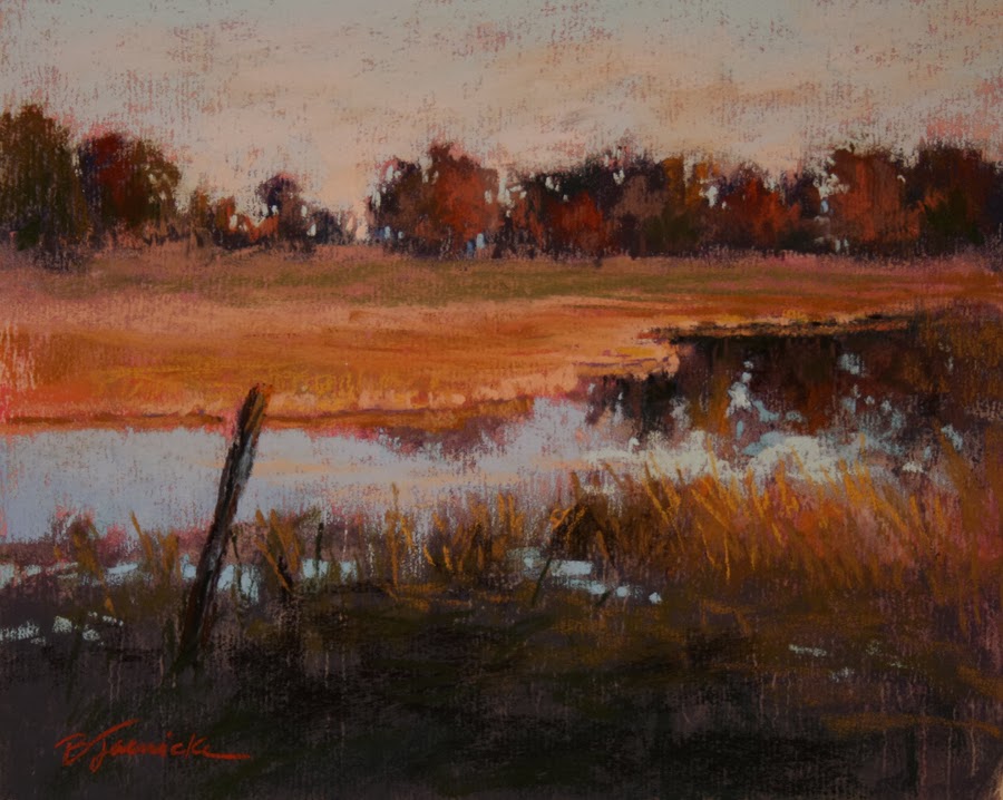
Autumn Marsh, pastel, 8x10

This past Friday I taught a one-day pastel workshop here in Atlanta. The topic was painting the autumn landscape. Autumn is probably my favorite season. I love the crisp, cooler air, the smell and crunching sound of falling leaves, and of course the beautiful colors.

I have to admit that when I first started painting autumn landscapes years ago, I went a little overboard on the color. I look back at this earlier work and feel like I need sunglasses to view it. I hadn't yet learned how to balance my vibrant autumn colors with the necessary grays and neutrals that make the more vibrant colors "sing." I also hadn't yet purchased the necessary pastels in these duller colors. These crucial grays and neutrals aren't the "pretty" colors that we pastelists normally gravitate toward.

One of the most important aspects of color use that I've learned over the years is that, more often than not, the best color for almost any particular area of a painting is usually duller than I first think to select. Learning this balance of color intensity for the various areas of the landscape is, I believe, one of the most critical concepts for any artist to learn.

For my two demos I painted for this workshop, I selected one cloudy day scene and one sunny day. Notice how there's more of a contrast between color temperature (dull vs. vibrant) in the cloudy scene (top) compared the sunny scene in which the color temperatures are still varied but to a lesser extreme. Often, the color on cloudy day scenes may actually appear more intense because of this more extreme contrast.

If you're having trouble with overly bright, garish looking landscapes, as your budget allows, you may want to invest in some sets of gray (not pure gray, but grayed colors) or neutral pastels. Many pastel brands offer such specific sets.

When I work with beginners who usually have basic starter pastel sets, we run into the challenge of having very few of those crucial dull colors. Yes, you can visually mix colors from a basic set (i.e., mix complimentary colors for a grayed effect"), but the result isn't as clean of a color application as if you apply the precise color you need. I never like having to tell new students that they have to buy more pastels. But thank goodness many of the pastel brands out there today offer the option to purchase single sticks a little at a time for those of us on a budget!

Friday, October 18, 2013

Strokes and Edges


October has been a hectic month, with November getting even a little crazier with lots going on in my schedule (all good stuff!), so this will be a short post. Just thought I'd share some demos I painted for a couple of private classes I held this week. Both were for experienced pastelists who wanted to work on some specific skills.

The demo at the top was based on a timed study. In our last session, I worked with this student on a minimal stroke exercise, and this week we worked from the same photo but gave ourselves a time limit of 30 minutes (after the underpainting was established) for an 8x10. I fined tuned my demo about another 10 minutes afterward. The objective was to start with a strong underpainting and use deliberate stokes sparingly without overworking.

reference photo for above demo

For the demo below, the primary topic was edges...hard, soft, disappearing. Over defining the subtle is often a stumbling block for many artists. Backing up from your work is one of the best ways to notice if you're over defining your edges, although many artists forget to do this. Edges often look soft up close but may actually be more defined that you think. Snapping a quick photo on your phone and viewing a shrunk down version is also a good way to check.


reference photo for above demo

Both demos were done from the student's photo.

Thursday, October 10, 2013

One-day Workshop: Painting The Autumn Landscape in Pastel

Autumn Splendor, pastel, 11x14

The image shown here is from a demo I painted a couple of years ago. The topic was actually regarding edges....more specifically, exaggerating hard and soft edges. However, it's become one of my favorites because of the color palette.

Autumn colors can often tempt the artist to overdo the vibrant colors that we find so appealing, resulting in a very garish color treatment. Knowing when to use those "brights" and when to tone things down is key!

Painting the Autumn Landscape in Pastel

Friday, Oct. 25, 2014
10 am - 4 pm
Spruill Center for the Arts, Dunwoody, GA
www.spruillarts.org

If you're in the local Atlanta area, I'll be teaching a one-day workshop on "Painting the Autumn Landscape in Pastel" on Fri., Oct. 25 at Spruill Center for the Arts in Dunwoody, GA. The details are on my website or at www.spruillarts.org. (Note: there IS a supply list for this workshop. The Spruill website may not be showing it. Just contact me for the list if you plan to register and the list is still not appearing the website.)

If you've been following my blog and are accustomed to seeing a weekly post regarding my classes that I teach locally from my studio, please know that I'm still teaching and plan to continue my posts. However, with a growing out-of-town workshop schedule, I'm needing to cut back on my weekly classes in order to have the time to prepare for my workshops and also have enough studio hours to produce work for galleries and shows. My local classes from my studio (which will now include oil as well as pastel!) will now be held once per month. Therefore, my future blog posts may not be every week, but possibly once or twice per month. Hope you'll continue to follow my posts!