Thursday, May 30, 2013

The Wall of Green

Through the Woods, pastel, 10x8
Painting the greens of spring and summer are always a challenge, but when there's not a lot of distance within your landscape, and you have the "wall of green" all up close, I find it to be even trickier. Increased distance between landscape elements gives the artist the luxury of using atmospheric (or aerial) perspective, which helps to create the illusion of depth and distance. Value, color temperature and manipulation of edges come into play when working with this illusion. But when it's all fairly close to the viewer, we don't have all those "tricks"...or at least not as many, and to a smaller degree.

Color temperature and edges are the two "tricks" we can still use, although not to the extreme that we could if more distance were involved. To push back the foliage furthest behind, I cooled down the color temperature a bit more than my photo was telling me and softened the edges. Where the sunlight was hitting more directly also dictated where my warmer color temps would be placed.

reference photo
Since I didn't have a whole lot of value differences in the foliage area (other than where sunlight was hitting), I needed to depend on my color temps and edges to do most of the work. Below are a few progression images from my demo. In the first image (the underpainting) I used exaggerated warms and cools to help with pushing back and pulling forward.


Thursday, May 9, 2013

Spring Greens, Part 3

My Quiet Little Spot, pastel, 8x10

For our last week of our series on painting spring greens today, I chose a spring landscape photo that was shot later in the spring. The landscape had greened up some more compared to the ones we painted earlier in this series. However, the grass still lacked the deep, rich greens that come later in the summer, and trees still weren't completed filled out with their foliage.

We still had lots of green to contend with, though. And when that's the case, I treat it like a big balancing act between warms and cools, and pay close attention to the values.

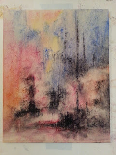
I wanted to create depth between the foreground/middle ground bushes and the taller trees further back. To do this, I used cool hues and lighter values (cooler and lighter than what my photo was telling me) in those distant trees, and established the cool color temperature right from the start in the underpainting. Contrast between soft and hard edges helped here, too. And even in the areas more toward the foreground, I still needed to balance the warms and cools. Since the sunlight was hitting the ground more that the bushes, with the bushes only getting skimmed with light, I used subtle shifts in warms and cools in the bushes (without too much value contrast) to indicate which areas were in light and which were in shadow.

The values of the foreground/middle ground bushes compared to the ground was a tricky area. In an effort to  depict the highlights on the bushes, it's tempting to make those highlights lighter than they are. But I needed to pay close attention to the fact that the LIGHTEST areas of the bushes were still DARKER than the ground.

Below are some progression shots, starting with my initial block-in and the alcohol wash underpainting...




Thursday, May 2, 2013

Spring Greens, Part 2

Springtime Awakening, pastel, 8x10

We continued with our series on painting springtime greens this week. When I was choosing the reference photo for this week's demo, I struggled with whether or not I could make something out of the photo I used for this one, "Springtime Awakening." The light was a little flat, and it really had quite the tangled mess of sparse springtime branches and foliage. Starting with large, simplified shapes was a MUST on this one!

Sorry, I was a bit lax on getting my progression shots this time, but below is my underpainting just after I applied the alcohol wash. I also included my reference photo below.


With the flat light, there wasn't much contrast between the foliage masses and the ground, so my large tree shapes in the underpainting couldn't be too dark.And as the painting progressed, the lighter overall values of the trees had to remain pretty close to those of the fresh spring grass With this subtle value range, I took my time searching for correct values, and hoped I wasn't putting any of my students to sleep as they waited for me to make my selections.

I was careful to place only a few well chosen very dark values where necessary to break up the close value ranges most everywhere else. The roof line of the distant structure helped to balance things with some horizontal dark accents.