Monday, April 30, 2012

"Minimal Stroke" Class

Minimal stroke pastel exercise:
 created with no more than 100 strokes.
5 x 7

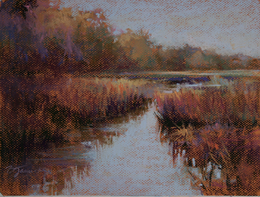
The Road Not Taken, pastel, 5 x 7
Started with the same approach as the
minimal stroke exercise.
I've decided that every so often I'll do a "mimimal stroke" exercise in my classes. I completely agree with my students that it's a painful exercise, but a worthwhile one.

Most pastel artists are attracted to the beautiful edges that we're able to create with pastel, which are unique to the medium. With no other medium can you create quite the same effect. Yet, so many of us tend to overwork our pastel paintings with far too many strokes of pastel pigment than is really needed. It's that yearning for perfection at every step of the painting that causes us to redo every stroke numerous times. I've learned that, especially in the early stages of a painting, we're better off putting down the stroke and leaving it alone! When you give yourself only a certain number of strokes to use, you need to ration them, and you're less likely to "fuss." You're also more thoughtful about not only the color and value of the stroke, but also how you'll hold the pastel stick, what direction to move it, and how much of it should touch the surface in order to create the stroke you want for that particular spot.

If you want to give this a try, you'll want to work small, about 5 x 7, or else you'll need many more strokes to cover the surface than the 100 I suggest for an exercise like the one shown above.

See my previous blog post on minimal stroke exercises for more details about what I cover in this class.

Friday, April 27, 2012

Spring Morning Sunlight, oil, 14 x 11
A couple of local artist friends of mine who attended the Plein Air Convention started the Limited Palette Challenge, which is based on the five colors that Ken Auster used on the amazing painting he demonstrated at the convention. The five colors are black, white, cadmium yellow medium, alizarin crimson, and utramarine blue. I've been busy with lots of other commitments since I returned from the convention a week and a half ago, but have been very eager to try out this limited palette, especially after seeing so many wonderful paintings already completed by other artists for this challenge. I finally had the opportunity to go out painting with a friend this morning to a beautiful location in Alpharetta, GA. I was happy with the results of this palette, and will be excited to try it some more!

Thursday, April 26, 2012

Peaceful Drama, pastel, 11 x 14
Since I recently returned from the Plein Air Convention in Las Vegas, I thought it would be good timing to focus on how painting on location differs from interpreting information from a photograph. A plein air painter often remembers many subtle details about a location that a photo simply can't capture...the temperature, sounds, wind conditions, precipitation, etc. In the case of this location shown in the painting here, these details were weren't at all subtle!

The frigid temps, strong, gusty winds, pelting rain, snow in the distance, and gorgeous bursts of sunlight through the clouds are still pretty fresh and vivid in my memory when I painted a small oil study of this scene during the convention at Spring Mountain Ranch. But at the same time, it was the weather conditions that created the dramatic beauty and mystical qualities.

What I found that differed the most from all of my photos that I took of this scene were the values and details of the line of trees. When the sun would burst through the clouds on the distant mountains, the trees went into shadow. But when the cloud cover became thick and the lighting was overcast and diffused rather than direct, the trees became much lighter in value and you could see their golden ochre color much better. I also remembered how much color was in the mountains. Photos will usually dull colors in the distance.

Since I liked the colors in the trees, I worked it into the darker values that I knew I still needed since the sun was not directly on them in this scene. However, I was careful not to go nearly as dark in value on the trees as my photo would lead me to believe. I remembered what these trees looked like when I painted them on location, and knew they didn't appear that dark and flat.

I also remembered the more vivid colors in the mountains and made sure to bump up their vibrancy, only slightly, though, sine they're in the distance, but just enough to create some nice color contrast against the trees.

The clouds were a source of drama the whole day on location, so I of course wanted to convey that in this painting. I typically don't play up the clouds too much in my paintings, but this was one scene that begged for dramatic clouds, so I had fun with them!

I taught this topic in my Wed. and Thurs. classes this week. "Peaceful Drama" is my demo from my Thurs. class this morning.


Tuesday, April 24, 2012

Beyond the Marsh, pastel, 17 x 24
Working on another larger piece for Watson Gallery in Atlanta.  I'm part of their spring show, "Southern Exposure" this Saturday evening. I'm hoping to squeeze in a couple more pieces for this show.  I'm a bit past their deadline, so I'm not sure if these recent pieces will make it in.  Either way, I'm excited to be part of this gallery and upcoming show.  I'll post details about the show later this week.

Monday, April 23, 2012

Empty Bowl of Apples, pastel, 9 x 12
In my weekly pastel classes that I teach, I focus on landscapes, since that's the primary focus of my own work. However, every once in awhile we have "still life week." A few of my students are into plein air painting, which I strongly encourage, but we do work a lot from photos in class. I think it's important to break from the photos once in awhile and work from life, whether it's outside or using a still life setup in the studio.

The more years of painting I get under my belt, the more I realize that you can take your abilities only so far working just from photos. In the past year, I've greatly increased the time I spend outside painting on location, and I feel it's made a positive difference in my work. You have to understand what happens to your subject matter when it's directly in front of your eyes. Shadows, highlights, values and color are among the key qualities that are compromised, or even completely lost, in a photo.

With today's still life class, I took the opportunity to focus on hard, soft and lost edges. I used objects in the set up that had the physical properties of "hard" (apples and bowl) and "soft" (cloth), but that's just the beginning. By using the old squinting trick we're always told to use, I asked students to look for areas where the edge disappears. This is normally where the values of adjacent areas are equal, and would be a lost edge that doesn't need defining. The highest contrast areas, with at least one object having a "real" hard edge, such as the bowl or an apple, will be your "razor sharp" edges. You don't want too many of those...only in a few key places. All other edges will appear softer, and would fall in between "razor sharp" and "lost." So by using more or less value contrast, and also with the application of a soft or crisp pastel stroke, you can manipulate your edges throughout the composition. This focuses the viewer's eye where you want it to go, and avoids giving equal emphasis to everything in the painting.

"Empty Bowl of Apples" is my demo from this morning's class.


Friday, April 20, 2012

Post-Convention Stress and the Elephant Analogy

Quiet Time, pastel, 17 x 24
Earlier this week I returned from the Plein Air Convention in Las Vegas. Many people have already posted about what a life-changing event this was, along with some spectacular details. I feel like I'm late to the party posting about it now, since so many wonderful comments have already been made. I came away with pages of valuable information, new friends and some great new art supplies to try out. But I think the most important thing I came home with was renewed inspiration.

Working on one of my plein air pieces during the
convention. (It was COLD that day!) Would love to
find the time to do a larger version of this one
I'm working on here.
Now...to focus that inspiration onto the long list of projects I have in the works. I'm itching to work up some of my plein air studies I did in Las Vegas and go through my many reference photos.  There's also this limited palette challenge that some of my local artist friends who also attended the convention have started...I'd love to make the time to participate in this. However, just before I left for the trip, I was contacted by a wonderful gallery in mid-town Atlanta and asked to develop some work for them. It's an exciting opportunity for me and I don't want to disappoint this nice gallery.

Add to that, I also have a couple of art auction projects for my son's elementary school (artwork done by kids that I need to "touch up" to make sales-worthy) due next week.

And it all has to get worked around my teaching schedule.

So I'm in this serious time management crisis! 

In the Marketing Boot Camp I attended at the convention, Eric Rhoads mentioned the elephant analogy. ("How do you eat an elephant? One bite at a time.") Although he was referring to how an artist must tackle each of the overwhelming marketing functions required for success, I find that I need to think this way to simply chip away at the painting work itself. And as we all know, creating artwork isn't like manufacturing something from a machine: The result isn't always successful. More stress.

When I get in these situations and start getting stressed out, I've found that the most important thing I can do is to sit down with my day planner (yes, I still use the paper kind!) and come up with a schedule. This is how I "chop up my elephant." I make good use of the time I'm able to spend at my easel. If I map out what days I'll work on which projects, I can relax a bit knowing that they're on my schedule, and I'll at least have a pretty good idea of when they'll each get done.

Now, about that painting way up at the top. This is one of the pieces I'm working on for Watson Gallery, my new gallery. I may punch up the color a bit on it; still deciding. It's a large version of an oil plein air study I did in Hilton Head a few weeks ago.  Also did a small pastel demo of this scene. Since I was motivated to get a couple more new pieces ready for this gallery before I left for the convention, I decided to tackle these first in the studio before delving into my convention plein air work. I'm confident that I came home from the convention with enough inspiration that it won't wear off if it's a few more days before I get to it.

Monday, April 9, 2012

Springtime Marsh, pastel, 9 x 12
Demo from this morning's class. Since I have several beginners in the class who are working on Canson paper, that's what I used for my demo.

Thursday, April 5, 2012

Use the Back Door, pastel, 11 x 14
My demo from this morning's class. We focused on harmonizing the color throughout the painting. The photo we worked from had lots of green foliage in the upper left corner, and vastly different colors in the rest of the scene.

I find that orchestrating color usage in a painting is one of the ways we can distinquish between copying a photo vs. creating original artwork. As artists we have to make decisions on how to interpret a scene so that it's believable (assuming it's representational art we're talking about, which I am here) but also reads as a cohesive, eye pleasing work of art. When an artist can pull all of the right elements out of his or her "bag of tricks," such as values, color temperature, edges, composition, etc., the scene that we depict is just an artistic playground for us to assemble the pieces.

In this painting, I made sure to use a limited palette. On a panel prepared with pumice gel on a mid-value "earthy orange" color, I started with an underpainting using three values of blues/purples, and then used an alcohol wash to establish the value structure. After that, I used under 20 pastels to complete the painting. A limited palette forces you to use some of the same colors in multiple areas that actually have very different local color. As long as the values are correct and the color temperature makes sense where it's placed, the colors will read correctly and give your painting a more unified look.