Thursday, August 14, 2014

More Greens


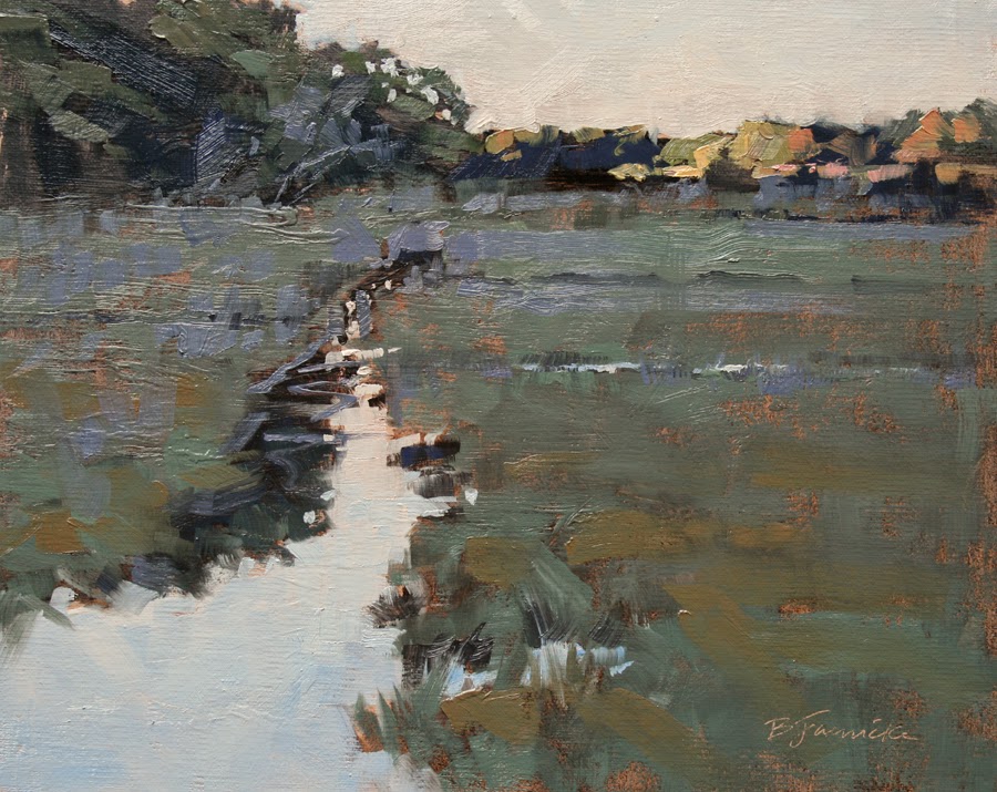
We tackled the wall of green again in my classes at my studio this week. The source photos I used for my demos conveyed several vague varieties of green, including the elusive "grey green"...another tricky color to handle.


When the true color just doesn't translate accurately from the camera, I think it's up to the artist rely on his or her own knowledge of values, color temperature, and color intensity. In some cases, you can slightly exaggerate what happens with atmosphere and distance--through small shifts in color temperature, hue or value--and enhance your artistic message in the painting.

Shady Spot, oil, 8x10

When working with a very green landscape, I tend to work in other various colors to balance the greens, often pushing the green hue into a different color family that will still convey the same temperature or vibrancy.

With the large amounts of similar looking foliage, I find it helpful to start by carefully organizing the composition into a few distinct shapes. Below are my initial block-ins for each of the above demos, along with the reference photos used for each:


Wednesday, August 6, 2014

Temperature Control

I held a couple of small private classes in oil at my studio this week and focused on color temperature with these students. Coming from a background of many years working primarily in pastel, color mixing in oil has always been a challenge for me. I've found that keeping the goal of capturing the color temperatures within the landscape, rather than trying to mix the exact color you see, often yields better results. Below are my demos from these classes.


Distant Light, oil, 8x10

Kimmons Mountain, oil, 8x10

When working from photos, there can be so much variation on the color represented--whether working from a back lit monitor (iPad or laptop computer), professional print, or a paper print from your home printer--that it's somewhat pointless to struggle with matching those exact colors. Instead, try to achieve the relative temperature contrasts between cools and warms that your source photo conveys.

For example, if you're mixing paint for an area you know is warm compared to what it's next to, mix up your "guess" and test it next to the cool area. Don't worry if it doesn't match the color in the photo, but test a dab of it next to the cool area, stand back, and after first deciding if the value is correct, observe if the two areas convey the same degree of warm/cool contrast that's perceived from the scene captured in the photo. I usually need several tries to capture an accurate value and temperature. (My students will vouch for that!)

In the end, you're better off spending more time fussing with the paint down on your palette and fussing less with it on the painting surface.

 Below are the block ins for each of the two demos...


WORKSHOP NEWS (Several locations just added for 2015!):
Over the next three months I'll be teaching in Wisconsin, Oregon and Texas. I've just updated my 2015 schedule on my website with several additions to now include workshops in Maryland, Florida (Bonita Springs and Jacksonville), Rhode Island, New Mexico, Maine, Minnesota, and New Jersey. Click HERE for details and my full workshop schedule.  


Monday, July 28, 2014

Back from Michigan and on to Wisconsin!

Top O' The Dune, pastel, 11x14

Last week I made another visit to the Traverse City area of Michigan, along beautiful Lake Michigan. I was there last year around this time teaching elsewhere in that area, and thoroughly enjoyed both of these visits! This one was for ArtCenter Traverse City, where I spent three days with a real friendly bunch.

Above is my one of my completed demos from this recent workshop, and directly below is another.

Snow and Stripes, pastel, 14x11

Shown below are these demos about  90% completed during the workshop, alongside the reference photo (on my iPad) and the thumbnails showing how I divide up shapes and then simplify those shapes. Sorry my thumbnails aren't showing up better here, but possibly you can zoom in on them if you're viewing this on something that allows that.


I typically cap off my workshops with some minimal stroke exercises. Shown below is my demo completed in 100 strokes.

100-stroke demo, 6x8

Next month it's on to Wisconsin to teach a 4-day pastel workshop for Dillman's Art Workshops Retreat, August 18 - 21. Details on my website at www.barbarajaenicke.com or at www.dillmans.com.


Thursday, July 17, 2014

Workshop News and some Plein Air Studies

Just a quick update on workshops I have quickly approaching...

If you're near the Traverse City, Michigan area, I'm teaching a 3-day pastel workshop there next week, July 23, 24 & 25. I was teaching in this area last year, visiting there for the first time and was amazed at how gorgeous the scenery is in this part of the country! There are still some spots available in this workshop! Visit www.artcentertraversecity.com for details.

Next month, I'm teaching another pastel workshop in Wisconsin at Dillman's Bay Resort & Workshops, August 18-21. I haven't visited this before, but am looking forward to it, since I understand it's like a resort for artists, with lots of other fun activities to do besides paint! This one is just about full last I checked, but there might be a couple of spots left. Visit www.dillmans.com for details.

My full schedule is on my website at www.barbarjaenicke.com, with more workshops to be added soon to my 2015 schedule!

I thought I'd also share in this post a few field studies I painted this week. It was a fantastic day of painting with a couple of artist friends in Ellijay, GA (North Georgia). We had perfect weather with cool summer temps, low humidity and LOTS of sunshine! Makes for a pretty day, but for those of us with real light-sensitive eyes, it really messes with judging color and value in the painting. So these sure needed some correcting in the studio.

Morning in Ellijay, oil, 8x10

Afternoon in Ellijay, oil, 10x8

Evening in Ellijay, oil, 8x10
The advantage of painting on location is having the ability to see firsthand the accurate values and color temperatures of the landscape, especially during the early and late hours of the day. When I need to make corrections in the studio, I try to do it very shortly after I painted them on location, so it's all still fresh in my memory.

In these studies, I tried to capture the lighting effects of each time of day. The "afternoon" painting has much more flat lighting while the early and late day paintings have more contrast in both values and temperature, with the later day painting having slightly warmer light.

Thursday, July 10, 2014

Screamin' Greens

This month I decided to tackle a subject with my local students that has always been--and still is--a challenge to me...painting green foliage, especially when presented as the dreaded wall of green in the landscape.

To simply try and match the hue that you see in the landscape (from either your photo or painting on location) can produce a monotonous painting. And I find that matching an accurate color temperature rather than a particular hue can capture the look and mood of the landscape more accurately, especially when working from a photograph.

Below are my demos from my oil and pastel classes. After I finished up my oil demo (study 1), I later decided to make an exercise of it for myself and continue to play around with color temperature, and try a slightly cooler palette overall (study 2). I have to say I think the first one captured the warm light a little better with the emphasis on the warms. But I suppose I just had to try the difference for myself to see that. (If I wasn't out of small panels, I would have painted a second version instead of on top of the first one!)

green foliage study 1 - oil

green foliage study 2 - oil

green foliage study 3 - pastel
With my pastel demo, the more muted treatment of the brighter greens indicated in the reference photo allows the area at the base of the trees to become a stronger focal point.


reference photo for oil study

reference photo for pastel study
We'll probably revisit those tricky screamin' greens again next month!

Tuesday, July 1, 2014

A Spattering of Workshop and Show News

It's never good to fall behind. But as I sat down to post this blog, I realized it really would have been better if I posted some of these things earlier. June was a crazy month with lots of events happening one after another, and I'm just now finding time to get back to my blog. I have lots of exciting things to share, but I'll try to make this brief...

A couple of weeks ago I taught two workshops in Massachusetts for the Pastel Painters Society of Cape Cod, and also judged their annual show. This group is packed with exceptional artists! Below are my demos from the workshop, and my demo ("Bright and Sunny") completed during their opening reception...


A Winter Day's End, pastel, 12x12. SOLD
Morning Mist, pastel, 11x14, SOLD
Springtime Memory, pastel, 11x14, SOLD
Into the Shadows, pastel, 11x14, SOLD
Bright and Sunny, pastel, 11x14, SOLD

Right after I returned from Cape Cod, I did a few loads of laundry, repacked it, and headed right back out to judge a show and conduct a demo for an incredibly nice group at Cape Fear Studios in Fayetteville, NC. Below is my demo for this group...

Evening's Shade, pastel, 11x14
Among other recent news is that I've had paintings juried into the 2014 Oil Painters of America Eastern Regional show (Cincinnati, OH, Sept. 12 - Oct. 9), the 2014 Pastel Society of America show (New York City, Sept. 2 - 27), and also was awarded second place in the Plein Air Magazine April-May Salon Contest! Each of these paintings are shown below...

Lingering Light, oil, 11x14
Juried into the 2014 Oil Painters of America Eastern Regional Show
Winter Evening Serenade, 12x16
Juried into the 2014 Pastel Society of America Show
The Six O'clock Show, 16x20
Awarded 2nd Place in the Plein Air Magazine April-May Salon

And finally, I wanted to mention two summer pastel workshops I have coming up that are almost full but each still has a few spots left. One is later this month--July 23-25--in Traverse City, Michigan. The other is next month--August 18-21--in northern Wisconsin. More details on these and all my upcoming workshops are on my website at www.barbarajaenicke.com.

Sorry to pack so much into this one post. But at least it's mostly pictures. :-)

Thursday, June 12, 2014

The Memory Test

In Front of the Bowl, oil, 8x8

I thought it was time again to get out from behind the photographs and work from a still life with my students at my studio. It's always a challenge to have a group work from a still life set up in my small studio, so I try and find creative ways to make it work. And I had already been pondering how to adapt a particular "memory" exercise for the studio and decided this could be a great way to handle a still life class.

If you've ever studied with Marc Hanson or kept up with news on his workshops, you probably know that he often has students do a "memory" exercise in his plein air workshops. I was once one of these "victims" who tackled this challenging, but eye-opening, exercise. In this type of exercise you view your subject in short intervals, and then paint in alternating intervals during which you can't look back at your subject.

I found that this exercise has a couple of beneficial results. First, it trains your eyes and memory to more closely observe the key elements of your subject before diving into your painting. But I think more importantly, you're able to keep your eyes focused on your painting for longer intervals without continually looking back at your subject, which allows you to make artistic decisions that will create a better painting rather than simply copy the subject.

For my still life memory exercise in my classes this month, I set up the still life in a separate room. It was actually my 10-year-old son's game room, which is adjacent to my studio...I had to clear a corner in this room and pay him $5 rent. ;-)

On the first visit to the still life setup, I allowed students to do a very quick sketch of the basic placement of the elements, to help get things started. (The setup consisted of two apples and a copper bowl.)  Next they went back to the studio and did a rough underpainting at their easel, and then continued with several alternating intervals of observing the still life and then painting (without peeking!) back at their easel.

Shown at the top and here below are a few versions in pastel and oil of my practice attempts (before my classes) and demos during class that I talked through in order to explain the process and give some tips on what to observe at each viewing interval.

Beside the Bowl, oil, 8x10

Apples and Copper Bowl, pastel, 8x10
Oddly, I like my very first practice attempt (at top) the best. I suppose the more acclimated I became with the subject matter, the more exact I tried to get with the rendering, and lost the fresh, loose approach I captured in my first try.

The benefits derived from an exercise like this will go a long way for the plein air painter trying to capture a quickly changing subject like a setting sun. Sometimes you only have about 5 - 10 minutes to capture certain lighting conditions in the field, and you may be better off just carefully observing and then painting from memory, rather than trying to paint a moving target. That's how I tackled the painting below, when I knew I wouldn't be able to paint fast enough. I did some minor touch ups back in the studio, but my photo reference wasn't very good and not much help, so even the studio touch ups were from memory and done really only to make a stronger statement of that moment captured in time.


Fading Fast, pastel, 8x10


Friday, June 6, 2014

Three-day Pastel Workshop in Traverse City, MI - July 23-25

Enchanted Evening, pastel, 16x20

I'm excited to be heading back up to a beautiful area of Michigan (Traverse City) next month to teach a three-day pastel workshop! In "The Pastel Landscape Simplified" we'll focus on...you guessed it...how to simplify the gargantuan amounts of detail that overwhelms us when painting the landscape. The initial block-in will especially receive lots of attention. The June issue of the Pastel Journal features an article I wrote on my block-in process if you'd like to get a little preview of how I approach things...


Workshop Details:

Art Center Traverse City
5152 US-31N
Williamsburg, MI 49690
fee: $320
July 23, 24 & 25, 2014; 9 am - 4 pm
Call 231-941-9488 or register online at www.artcentertraversecity.com

Last I checked, there's still room...Hope to see some of you there!