Monday, July 29, 2013

Composition Boot Camp Wrap-up...and plans for the next one!

Scattered Evening Light, oil, 10x8

Meandering, pastel, 8x8

This past weekend I taught a workshop titled "All Media Composition Boot Camp." In my experience, I've found that composition is the one area that artists tend to "fight" learning. It involves a little up front planning before paint is mixed, paper is taped to a board, pastels are set out, etc. It's not the fun, colorful part of the painting process, and usually involves those rough-looking, sometimes unattractive, black and white sketches.

I used to fall into this category. There was a time when I just didn't "get" the purpose of a thumbnail sketch. Why draw it small when I'm going to draw it all over again big?

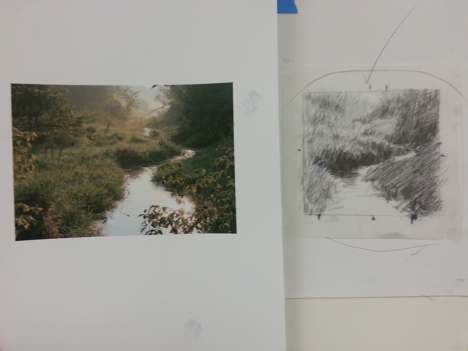
Over the years I've come up with my own, somewhat unconventional method for working out my compositions. It's a quick, easy and accurate way to put my painting puzzle together before I put a single mark on my expensive surface. And these days, I actually enjoy this planning process...it's where I begin to see the possibilities of the painting. For my studio work, I feel it's a crucial process for the success of my work. But honestly, with the method I use, I really don't spend very much time laboring over the process.

Like most artists, when working from photos, I begin my composition process in the camera. The process then moves to Photoshop (I use Photoshop Elements), where I can very quickly look at additional cropping possibilities. There are many other digital tools (iPad, etc.) that also allow you to quickly and easily do this. But even after additional cropping is done, I find that, in order to get the most ideal composition, I still need to tweak, pull stretch, etc. This is where I stray a bit from the norm and pull out the old fashioned tracing paper...yes, tracing paper...and shift things around by placing it over a cheap print out of my photo.

In my classes and workshops I explain my method more thoroughly. But following below are some shots of thumbnails and my block-ins. In this particular workshop, the focus was on planning the composition, and holding true to the original plan in the block-in stage. In my demos, I took the painting just a bit further than the block-in stage, and finished them off later back in my studio. (Finished versions are shown above.)


oil demo - block-in


reference photo...cropped from the original photo

original version of the same reference photo


pastel demo - block-in
loose pastel application over block-in
One thing I always stress when initially developing a composition is to simplify the landscape into as few shapes as possible...connecting shapes wherever possible. This is what needs to be worked out in the thumbnail stage, and then followed during the block-in stage. When I block in a painting, I look at my thumbnail, not my photo.

I should note that I only do this much planning with my studio work. When I'm painting out on location, my goal is to capture the mood, atmosphere and lighting conditions quickly before it changes too significantly. I still go through all of the same thought processes that I use when planning with thumbnail sketches, but it's done in my head rather than on paper.  I don't always get it right, but often the goal with plein air painting is to come back with a good study that can be refined into a larger studio piece.

In September I'm teaching this workshop again in Dahlonega, GA. It's a two-day workshop, Sept. 5 & 6, at The Art Loft. Visit www.artloft.net or see the workshop page on my website, www.barbarajaenicke.com, for more information.

Thursday, July 25, 2013

Up Close & Personal, Part 3

Hidden Mountains, pastel, 10x8

In our third week of my class's Up Close & Personal series, we moved out of the water and into the trees. With trees, when you zoom in, you have lots of busy chaos...up close! My goal with this painting was to create connected shapes in the trees that would contrast against the distant mountains.

My reference photo showed a hint of bluish mountains behind the gold trees. I liked that color contrast and decided to move the mountains up a bit so that I could have more opportunity to set up that contrast with negative shapes peeking through the trees.

reference photo
In my underpainting I mainly focused on blocking in the dark values with a large connected shape, and then used a small amount of lavender to contrast beneath where the brightest gold hues would be placed (difficult to see here in the underpainting photo, but it's there). I also used a warm pink beneath where the blue-grey of the mountains would be placed, and then yellow in the sky to tie in with the eventual gold hues of the tree. I ended up covering most of this yellow, but I find that blues in the sky area have more life to them when placed over a warm hue beneath.


Sorry, I didn't remember to take my next photo until I was too far into the process. Stay tuned for Part 4 in this series!

Friday, July 19, 2013

Up Close & Personal, Part 2

A Quiet Little Spot, pastel, 8x10

Continuing with our "Up Close & Personal" series in my weekly pastel classes, we studied another water scene, this time with some sticks and branches. And also still with some wispy grass, as with last week's example, it was still crucial to begin with large, connected abstract shapes. I blocked in these shapes as loosely as possible; however, they were carefully placed (previously planned out in a quick thumbnail sketch). The block-in was done mostly monochromatic, with some added orange placed beneath where the bright blues of the water would be added.


While working over the underpainting, it was important to keep the large shapes as connected as possible while breaking down each area with only the necessary details.


As you can see from the source photo, lots of editing took place here. I only added a small amount of the skinny branches...just a few to catch the light...and kept the grass only loosely indicated, since I wanted the focus to stay on the sunlit base of the tree.

"A Quiet Little Spot" is my demo from my Thursday class.

Thursday, July 11, 2013

Up Close & Personal

Cattails, pastel, 8x10

I started a new series in my classes this week that will focus on zooming in on a small area of the landscape.

Often with landscape painting, we want to depict distance, sometimes even miles and miles, going as far as the eye can see. And sometimes we paint a large, vast area simply because we want to include a variety of elements in order to capture interesting contrasts of colors and textures. But some of the most beautiful paintings zero in on just a tiny snippet of the landscape...maybe just a few feet (or even less) of distance, creating unique compositions with a close-up view of items we don't normally pay much attention to.

As with any painting, starting with large abstract shapes is key. Although when zooming in close to your subject, it becomes even more tempting to go after small details too soon. With my subject matter being thousands of thin, wispy blades of tall grass, I knew that I had to ignore detail completely in the initial stages and instead establish my abstract shapes.


I must say that my underpainting isn't one of my more attractive examples, but I did it quickly and it did the job I needed it to do. With such a thick mass of grass to work with, I wanted to get my darks in first and work my lighter and brighter values over top. In the underpainting, I also snuck in some subtle warm hues where I knew I'd need them, such as in the grass (above the reflections in the water) and the blue area of the water.

The challenge of this painting was to keep the rendering of the grass as simplified as possible as it progressed, but not lose sight of the overall shape of the grass formation.

reference photo

 "Cattails" is my demo from my Thursday class.

Monday, July 1, 2013

Composition Boot Camp

One-way Road, oil, 8x10

Coming up this month and in early September I'll be teaching one- and two-day workshops in Georgia focusing on composition for pastel, oil and acrylic.This is the perfect opportunity to try those more daring compositions that you wouldn't normally pursue...

Composition Boot Camp (Pastel/Oil/Acrylic)
Push yourself beyond the typical composition. Bring your own landscape photos that you normally work from and we'll put them through an intensive composition workout. Through numerous quick studies, you'll move, stretch, crop and basically push the limits of basic landscape subject matter and get that "wow" factor into your compositions. Oil/acrylic painters and pastel artists who work in a representational style and are already familiar with their medium are welcome.


Atlanta, GA - 1-day workshop
Spruill Center for the Arts 
5339 Chamblee Dunwoody Rd.
Atlanta, GA 30338

Sat., July 27, 2013, 10 - 5
$100
To register call 770-394-3447 or visit www.spruillarts.org.


Dahlonega, GA - 2-day workshop
The Art Loft
Sept. 5 & 6 (Thurs/Fri), 2013

$225

To register, visit www.artloft.net.

Thursday, June 27, 2013

Painting the Southwest, Part 2

As Evening Takes Shape, pastel, 8x10

With southwest scenery still rolling around in my head from my recent visit to New Mexico, my students were stuck painting the desert again this week. They didn't seem to mind this week either. I think we all agreed...it's a gorgeous part of the country.

For this week's exercise, I thought we'd take the sky out of the mix and crop into the landscape to create some bigger shapes. Not that the southwest doesn't have some amazing skies to paint, but this particular landscape already had some great shapes happening, and I thought the tighter crop would highlight this and make for a more intimate view. However the sky from above is still speaking loud and clear by how its reflected within the landscape elements.

Regarding color palette for this one, I noticed a striking difference in colors (both when painting there on location and from my photos) when the sun got just a little lower in the sky, and also where the sun hit the landscape directly vs. indirectly. Compared to last week's class demo, the photo used for this scene (in the same general location as last week's) was taken just a little earlier in the evening. Last week's was a little later in the evening and was also a view that was catching the setting sun more directly, providing a much warmer color palette chock full of oranges and pinks. Whereas this view caught the sun coming from the left side and not quite as low (or golden) in the sky, providing a more cooler and subdued color palette. Amazing how the angle and direction of the sunlight can affect color so much!

In an initial thumbnail value sketch, I worked out the division of space and angles of these large shapes, connecting similar value shapes wherever possible.* My initial block-in was done from the value sketch (not the photo). Below are some progression shots of my demo, starting with the block-in using about 6 pastels (Nupastels and Rembrandts) then washed down with alcohol and a bristle brush. As I progressed, I added details in "large chunks" before deciding toward the end what few details needed to be even smaller, and continually checked my values for accuracy.


*I teach my process for working with thumbnail value sketches more thoroughly in my workshops. See my website (www.barbarajaenicke.com) if you're interested in taking one of my workshops.

Thursday, June 20, 2013

Painting the Southwest

Where the Road Leads, pastel, 8x10
Whenever I come back from a painting trip, stocked full of studies painted on location and reference photos of the area, I'm always eager to teach a topic in my classes that relates to what's fresh in my memory. I was actually prepared to hold a still life class the week after I returned from New Mexico. What was I thinking? With all that beautiful southwest imagery still floating around in my head? My students will be painting Albuquerque for the next couple of weeks! Since several of my students also visited Albuquerque to attend the IAPS convention, I didn't get an argument.

This week's demo was from a photo I took just a few steps from several areas where I painted on location. The challenge here was to accurately capture the distinct dark and light values on the mountain...without making the shadow areas of the mountain darker than the dark bushes on the ground, or the light areas of the mountain lighter than the sunlit grass. Also within the mountain values, we examined how the shadow areas still had highlights, but those lighter areas within the shadows still had to remain considerably darker than the sunlit areas of the mountain.

Below are a few progression shots. I guess with being out of town a lot the past few weeks, I didn't remember to snap all the shots I normally do in each class, so I've cheated here a bit. The three shots below combine shots from both Wednesday's and Thursday's demo. Both demos looked very similar, so I think I can get away with it here. ;-)

The initial layers are started with about 6 pastels (Nupastels and Rembrandts) and then wet down with alcohol and a bristle brush.


I also wanted to briefly share here another painting I completed this week, working from my favorite study that I painted in Albuquerque. This one began with my typical underpainting, much like I normally begin any of my paintings. Although this wasn't a demo, I felt compelled to snap a quick photo of the underpainting. Later, looking back at it, I was real satisfied with how I simplified the shapes in a very clean yet abstract manner. It really made the rest of the painting go smoothly and more quickly than usual.

Path of Light underpainting

Path of Light, pastel, 16 x 20

Sunday, June 16, 2013

Convention Recaps!

I try to keep up with my blog posts about once a week, but with two trips out of town in the past few weeks, things have gone off track a bit...but for good reasons!

The first trip was to the Oil Painters of America (OPA) National Exhibition and Convention in Fredericksburg, TX last month. I'm still on cloud nine just knowing that I had work included in this extraordinary show. Plus I had the awesome opportunity to meet many artists I've admired for quite awhile and watch some incredible demos! I don't have as many photos to post as I do with what I discuss below, but this event was certainly just as exciting and inspiring!

"Afternoon Refuge" proudly hung in the OPA national show.

Then last week I attended the International Association of Pastel Societies (IAPS) Convention and Exhibition in Albuquerque, NM. This was my second time attending this inspiring week of nonstop pastel EVERYTHING! I watched demos and took workshops from some of my favorite artists, purchased a couple of much needed pastel supply items, and even got in some painting time at some gorgeous locations in the area. I also, again, had the wonderful opportunity to meet many new artist friends.

A couple of other exciting tidbits from IAPS...my painting "December Heat Wave" was awarded an honorable mention by Terri Ford, who judged the Master Circle portion of the IAPS Exhibition, and I also received my Master Circle medallion.

"December Heat Wave" was awarded honorable mention.
This thing is heavy!

Although I've been an instructor myself for a number of years now, whenever I take a workshop, I always make sure to put myself into "student mode" and turn myself into a sponge, absorbing as much new information as possible. As an instructor, I teach methods that I've found to work best for me, so it's tempting to want to approach any painting I do in a workshop using my own method. But I find that it's a waste of time and money to do this in a workshop taken from another instructor. The reason I set aside time and money to take any workshop is to learn how a certain artist does what he or she does. So I turn off all previous knowledge, I do my best to bring exactly the supplies given on the workshop supply list, and try it totally and completely their way. Even if I don't want to later continue to paint exactly like these particular artists with whom I'm studying, I want to find out how they achieve their unique "look."

My first workshop was with Terri Ford. Her "deeper, darker, richer" approach helped me see that a more intense color can be used rather than a lighter value in order to liven up color that may show up dull, or even nonexistent, in a bad photo. After a few attempts at her approach, I found myself making some exciting new color choices I wouldn't normally use. Loved it!

One of my paintings from Terri Ford's workshop.

The other workshop I took was from the amazing Richard McKinley. This was only a one-day workshop, and I sure wish I could have spent more time watching him paint and hearing his comments on my own attempts. I really wanted to better learn his watercolor underpainting approach. So I watched closely, took lots of photos of his demo, and spent lots of time on my attempt. As I mentioned above, I really try to purchase the recommended supplies. I did have a varied supply of the watercolor paint recommended, but I knew going in that I may not have the best quality watercolor paint. They were artist quality, but not the kind Richard uses. I wanted to buy more before the workshop, but it was a budget limitation. This made a difference in the color vibrancy that Richard was able to achieve vs. what I painted.

Richard McKinley's vibrant underpainting.
My much duller underpainting.

My finished? painting with pastel added.
When taking a workshop, I bring a variety of my own photos that are similar to the typical subject matter that the instructor normally paints. And after watching the demo, I choose a photo from my supply that's as similar as possible to what the instructor just painted. In this case the most similar photo I had on hand coincidentally was the one I referenced for the painting I had in the OPA show!

During the convention, I also watched demonstrations by Marla Bagetta, Desmond O'Hagen and Lorenzo Chavez...three of my favs! All were spectacular and a joy to watch!!

I'll end this post with a few pieces I painted on location in Albuquerque among many other incredible artists. All were painted in the beautiful magic hour of the evening light, with the last one at the bottom painted fast and furiously as the light disappeared.